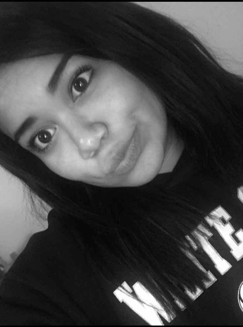
Self project
1. Pieces of glasses showing the reflection of ur face
2. abstract over face
3. face through window
4. face in funny morphing glass
5. my hands on my face
6. silly expression on face
7. photograph of face wrinkled up
8. watermark of image on face
9. droplets on face
10. stretching my cheeks with my hands to make a silly face
11. face pushed against something like window
12. my face in opposite colors
13. Half of my face in black and white while the other half is in a cartoon face
14. face in one complete lighting like red, blue, yellow
15. face with cracks
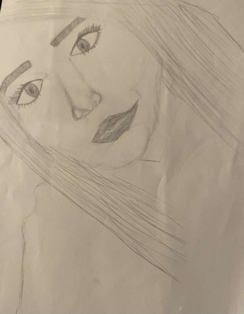
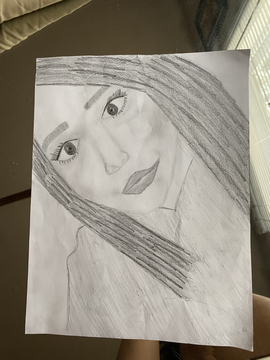
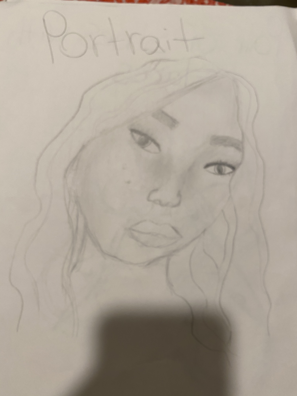
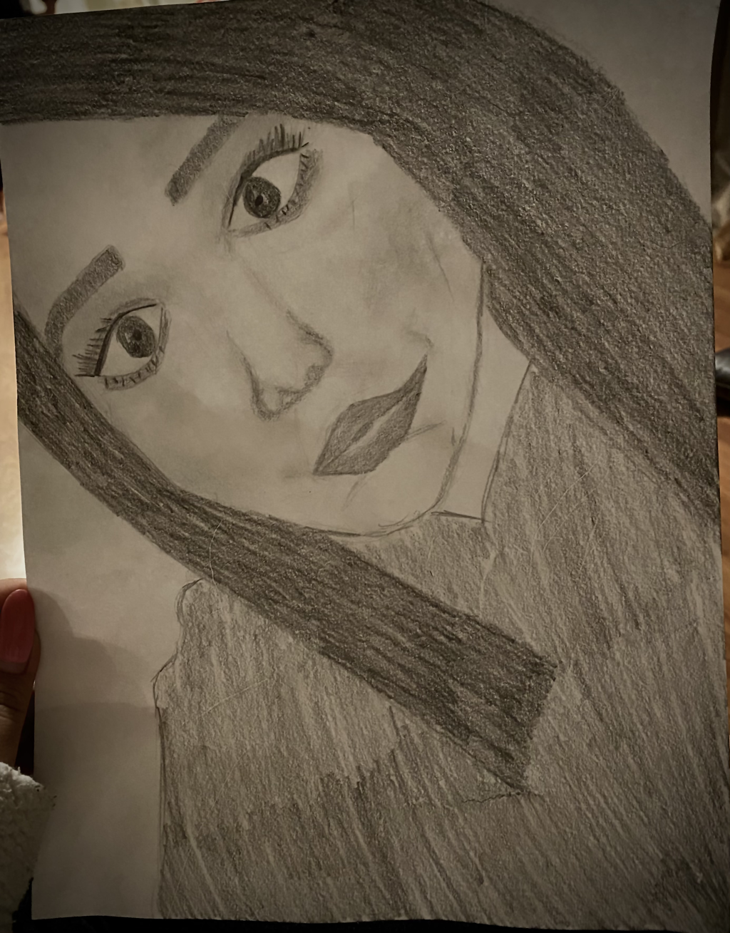
Final self-portrAit
1. It took a lot of erasing and examining features and fine lines.
2. I chose expressive. I decided to draw myself making a silly face.
3. I believe I could have done a better job at adding value without messing it up even more. I feel like each time I tried to add more value, the drawing smudged even more it it looked even worse.
4. It could have been more executed and crafted more neatly. There were a lot of smudges and really bad erase marks on it that just looked worse the more I erased it.
5. I was able to capture the look better by looking closely at my features and wrinkles as well as how my head was tilted, how my hair was placed, etc.
6. I did the method that we learned in class to get the right measurements.
7. It is important to know how to draw features individually because you can practice looking closely to the details that make an individual feature.
8. The most beneficial part of this unit was learning how and where each feature goes on the face to make your face actual look more real and symmetrical.
9. I had to erase some features completely to make them look more like the picture. I would also have a lot of trouble with smudging. My hand would smudge around the drawing on accident when drawing.
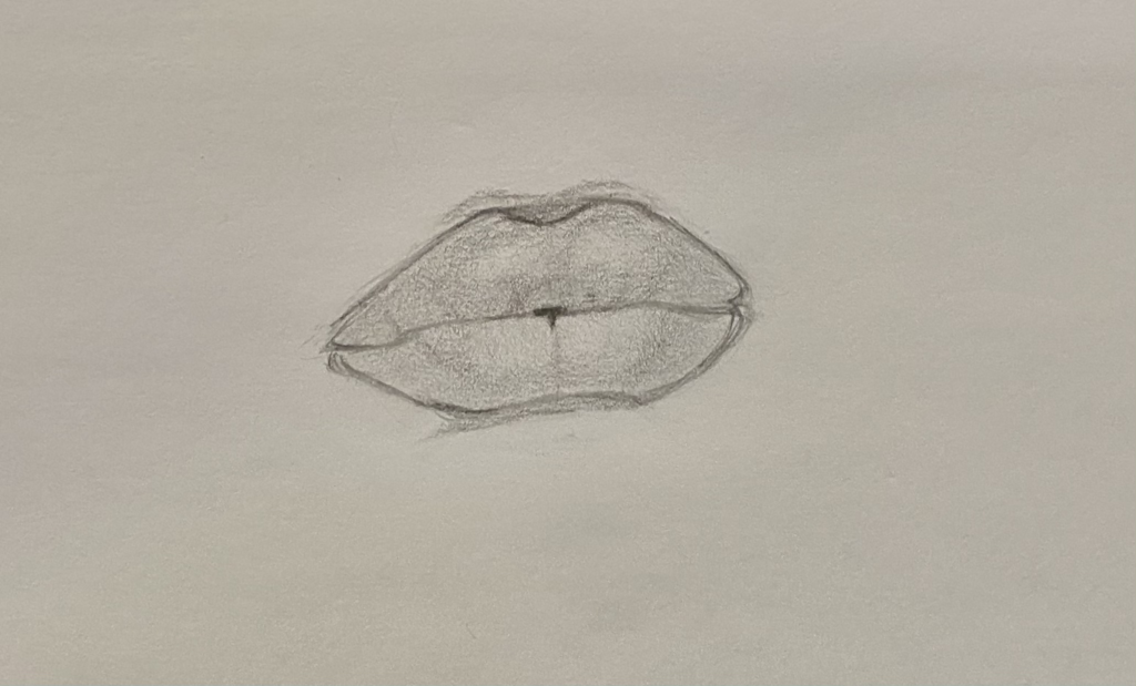
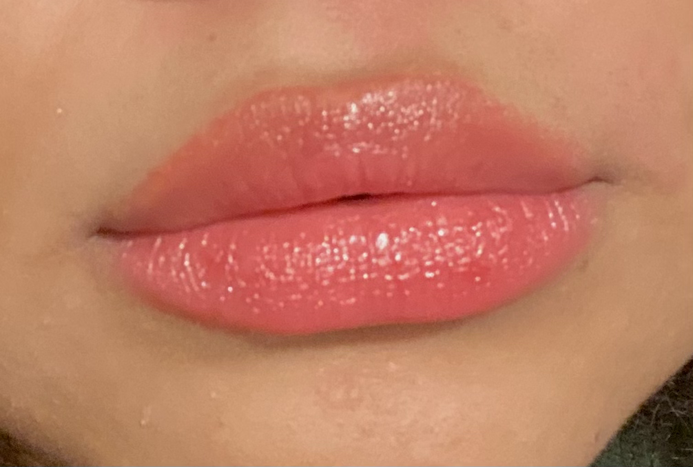
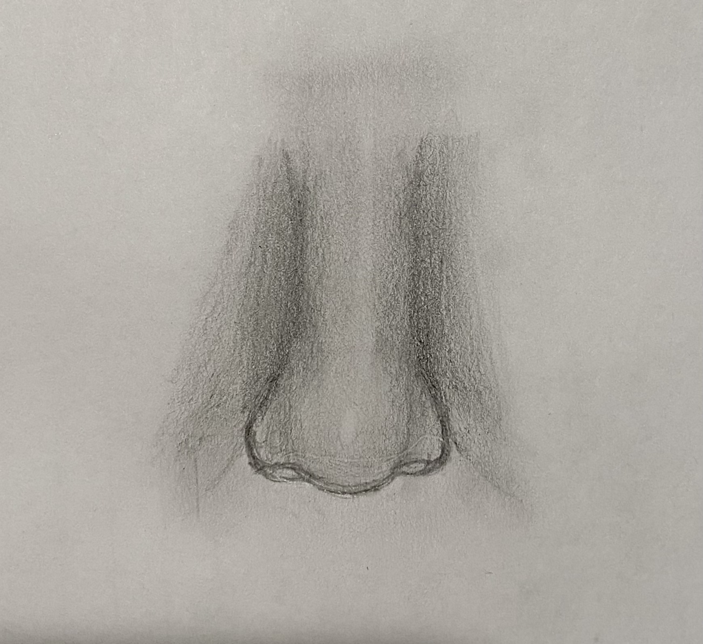
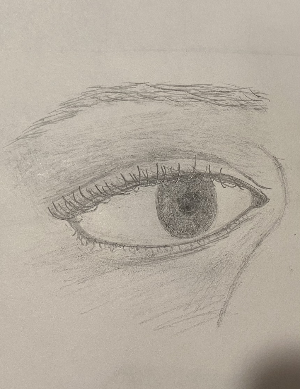
Facial features drawing
Face
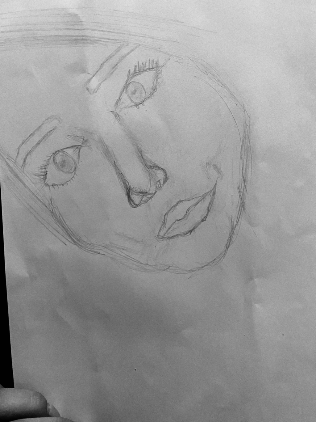
Mouth
Nose
Eyes
Colored pencil and pastel
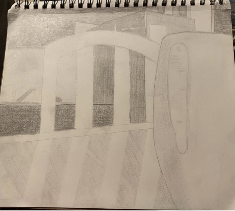
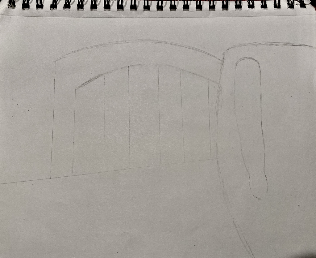
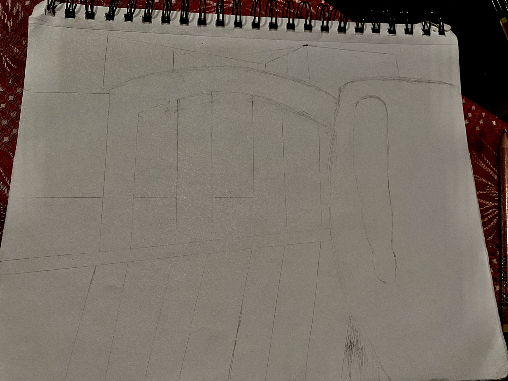
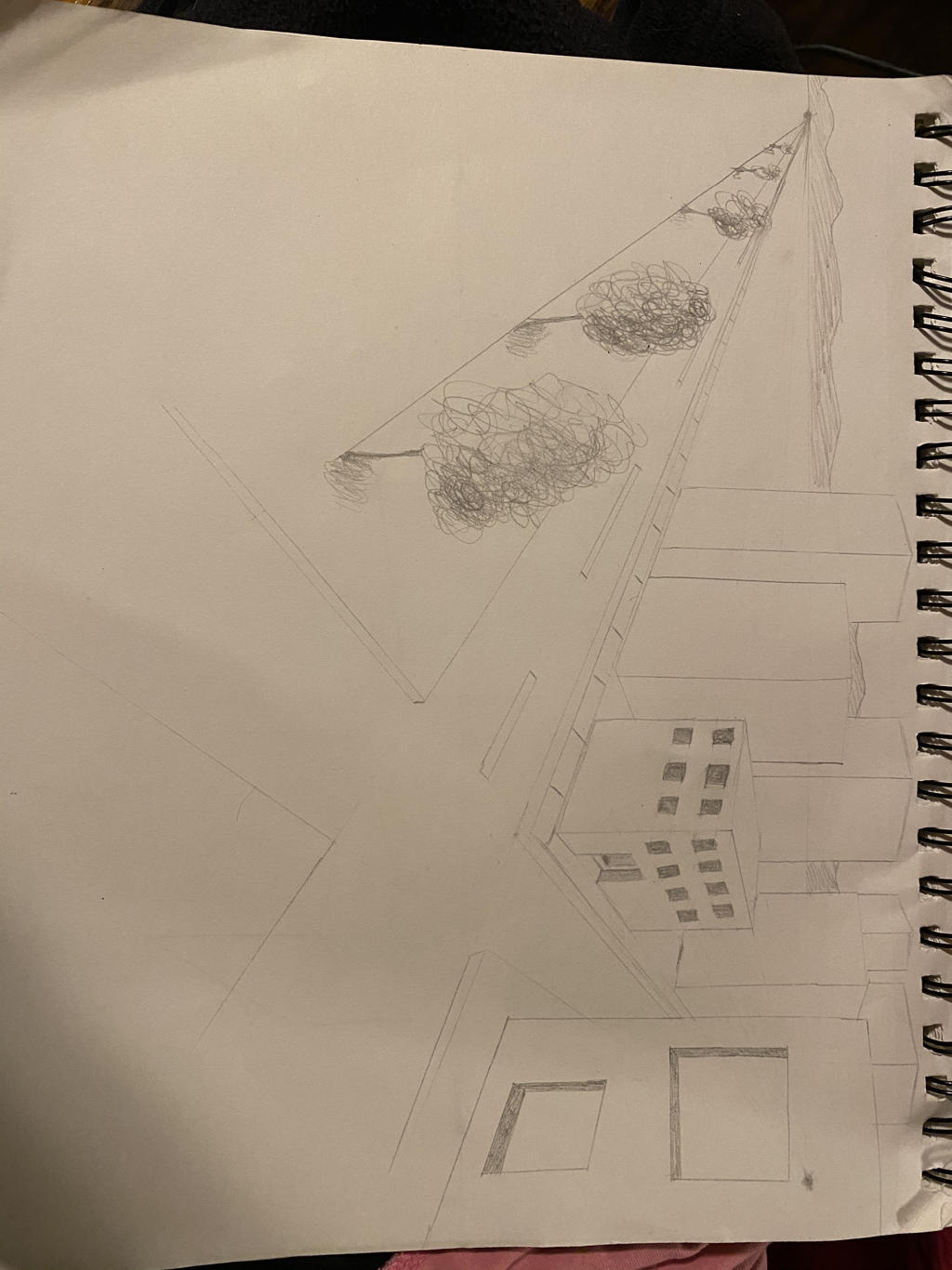
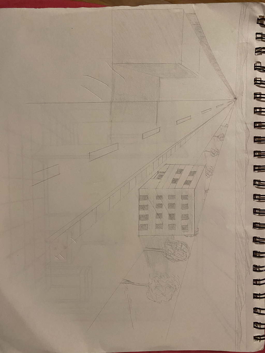
Look at that view
1. I drew part of my kitchen. I think I could have added more value, so I wouldn’t say it was completely successful.
2. It is important because it engages the viewer to look at your drawing with more depth. It captures the drawing better.
3. They helped me practice perspectives and differentiate them so I would know what to draw and how to take a picture correctly.
5. I think I was because i don’t a drawing behind a mug the. Behind a chair to show the rest of the kitchen.
6. I liked doing the perspective drawings. If wasn’t extremely difficult and it will help to make more drawings in the future. Some obstacles that I had was drawing the depth and the values to make the drawing look more realistic. Some advantages that I had when drawing was when I had to draw the background. I feel like I drew it pretty well compared to how I thought I would do.
7. I think I would have like to have been taught how to add blurry details. I feel like all the videos we had to watch and the example drawings during class helped a lot to get me prepared.
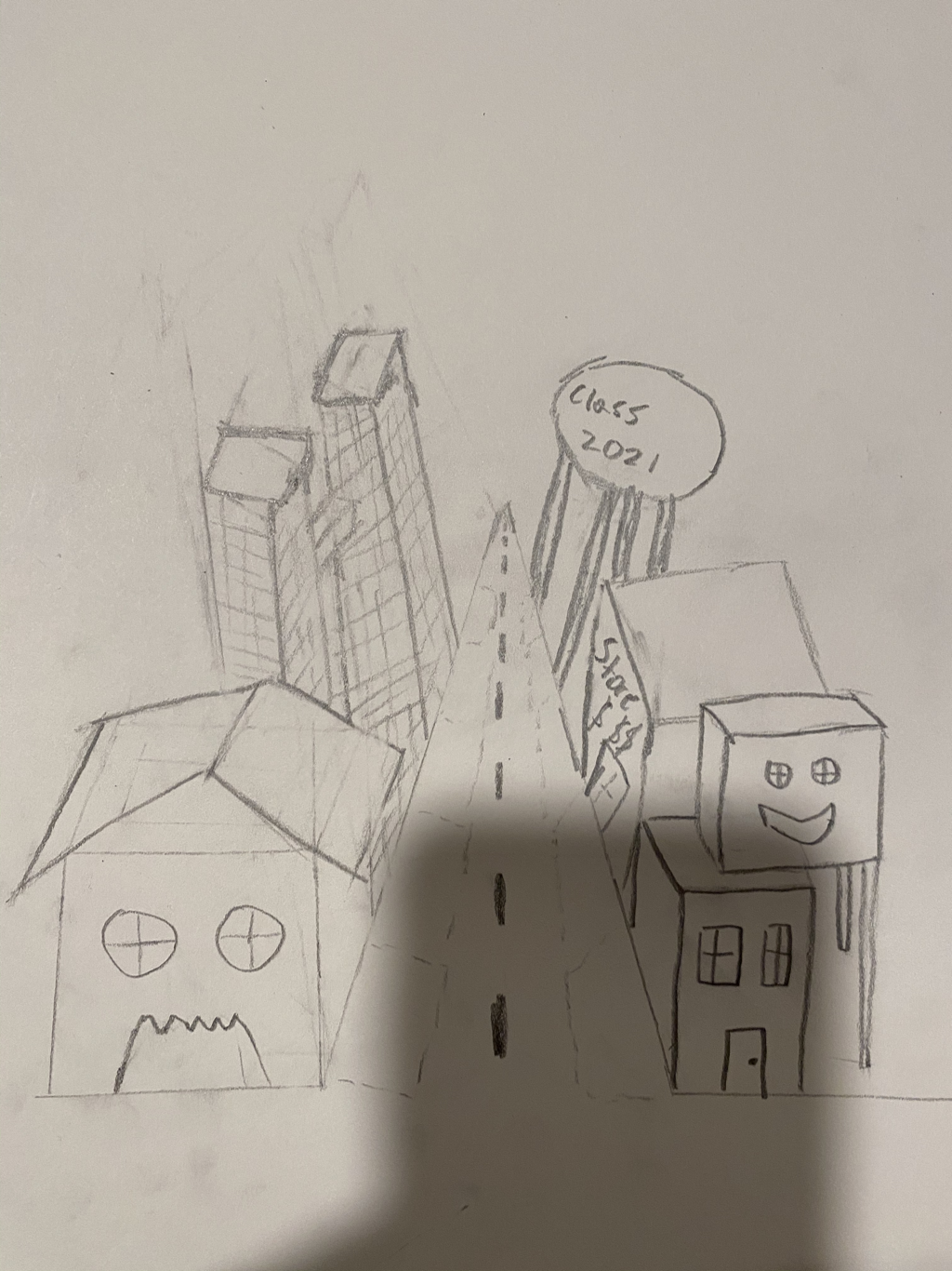
FInal DRAWING
1. Worms view of street
2. Birds of view of plant
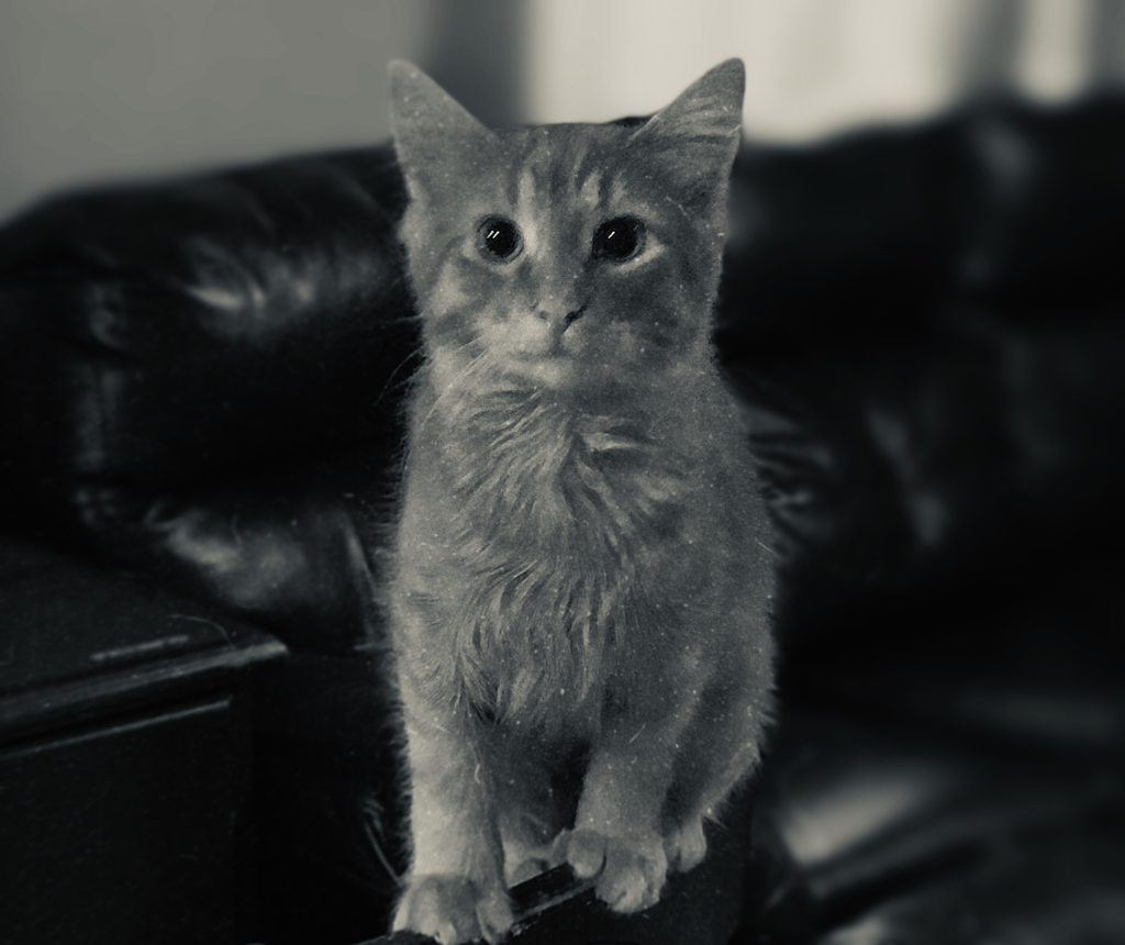
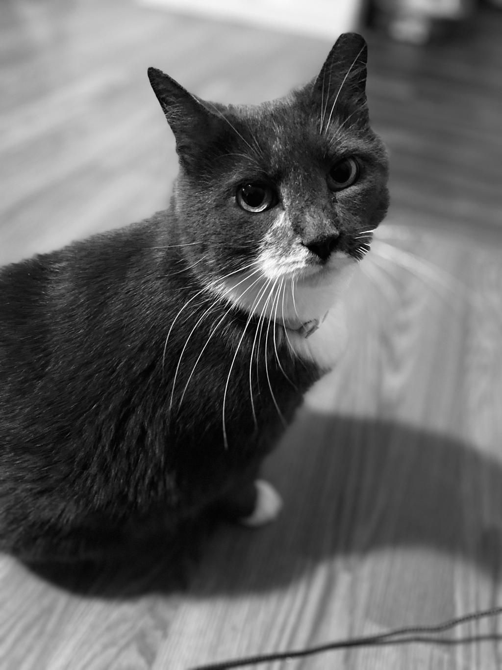
3. birds eye view of cat
4. birds eye view of flowers
5. birds eye view of mug
6. worms eye view of tree
7. worms eye view of soccer ball
8. birds eye view of piano keyboard
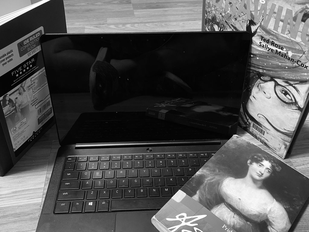
9. Birds eye view of jar of stuff
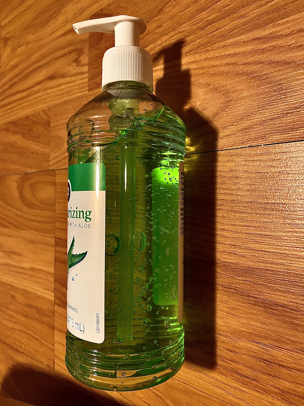
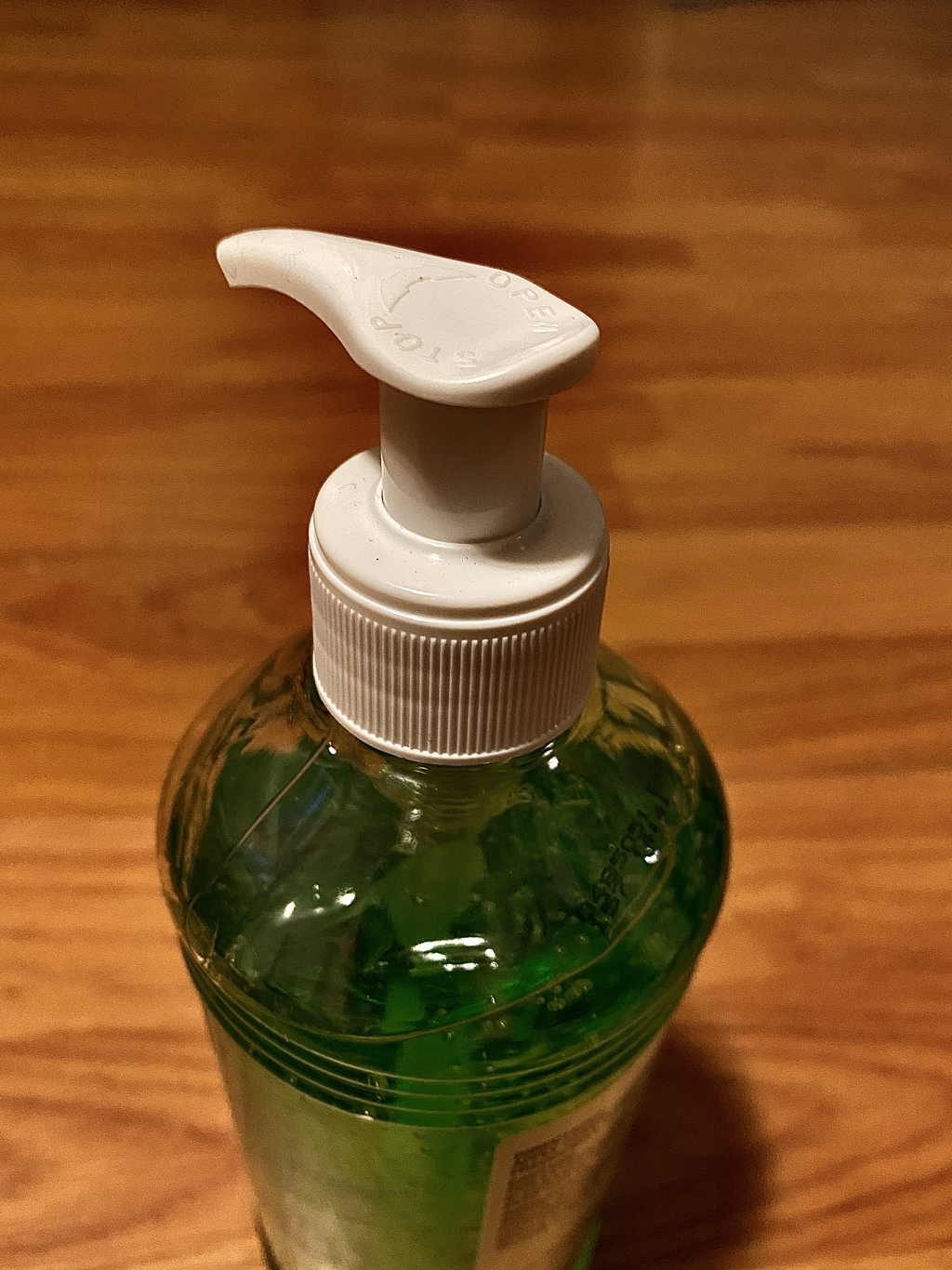
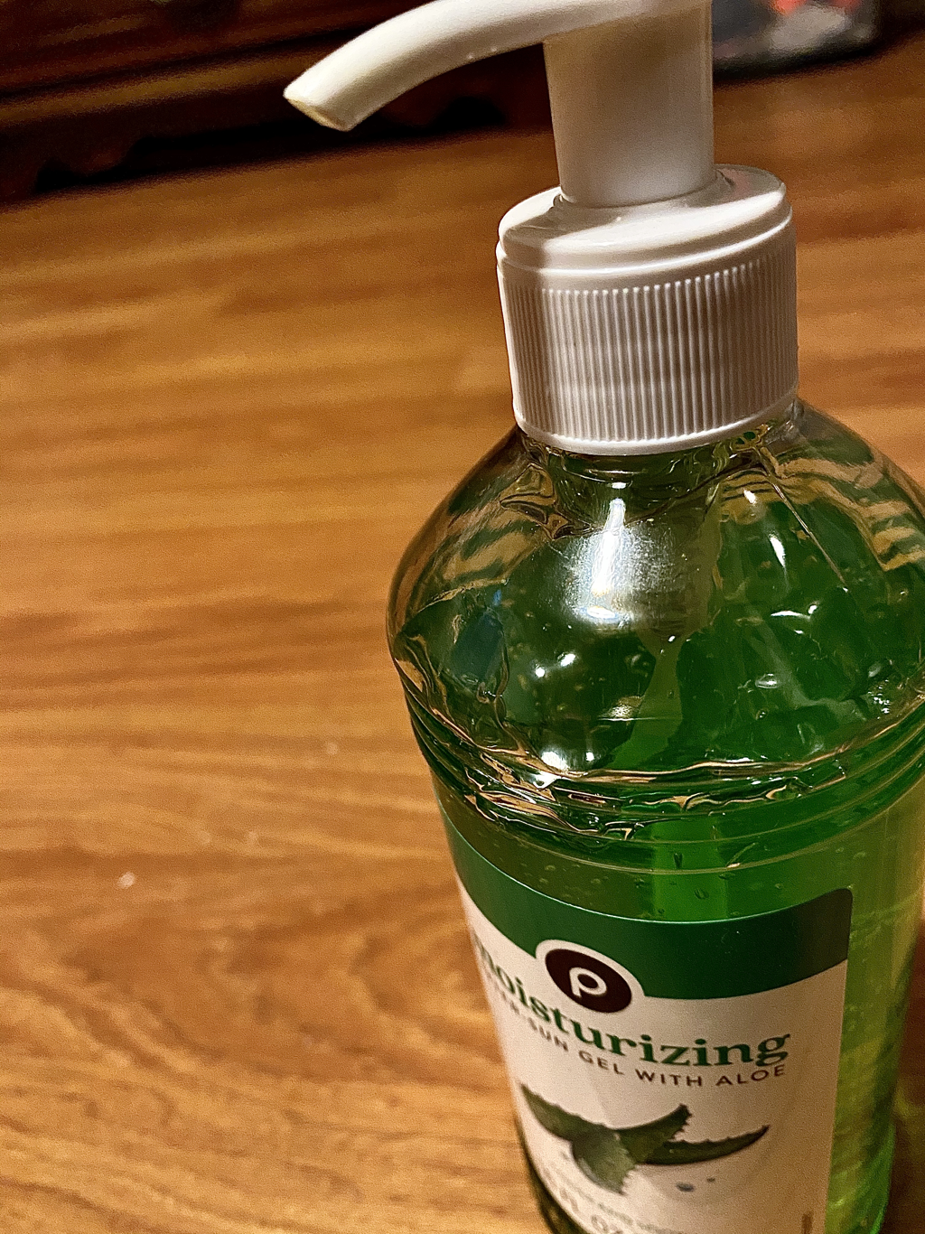
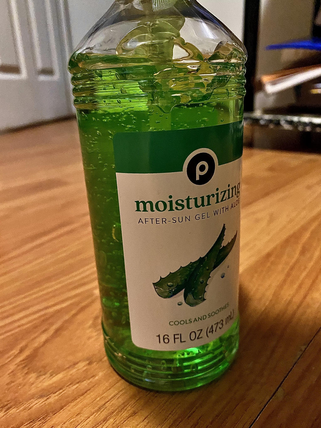
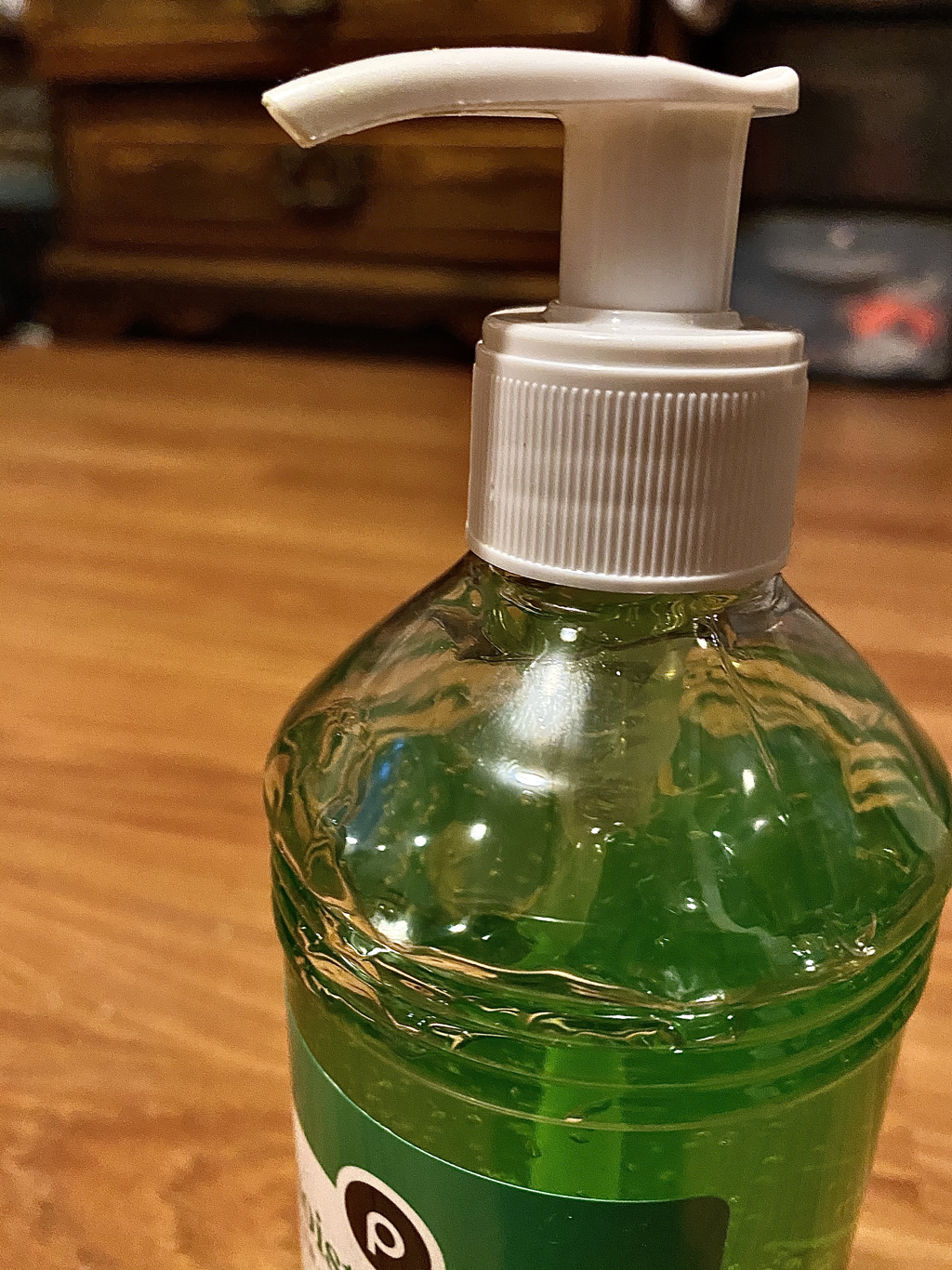
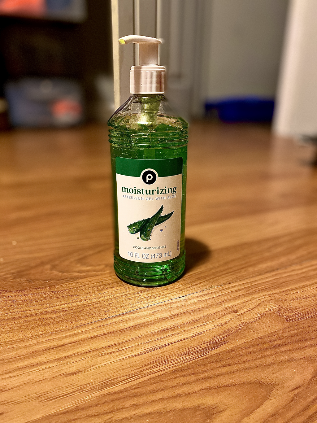
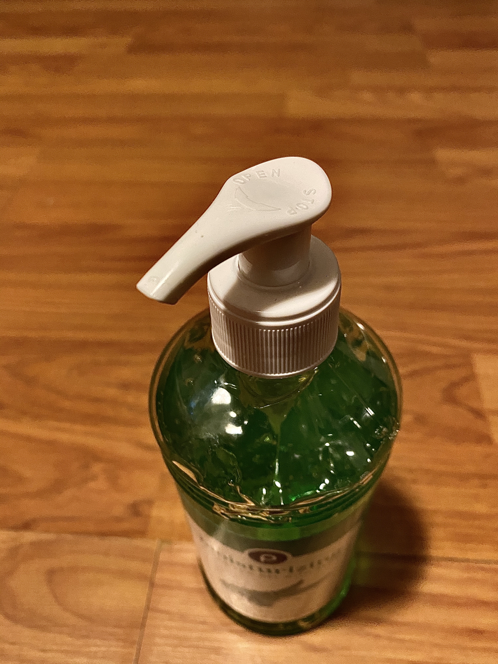
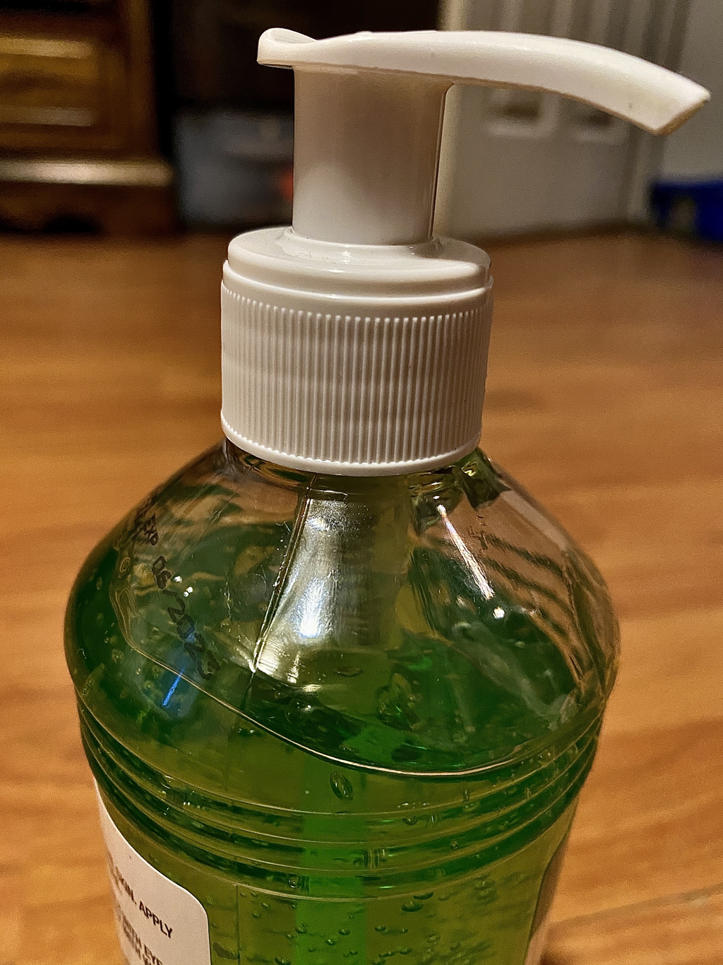
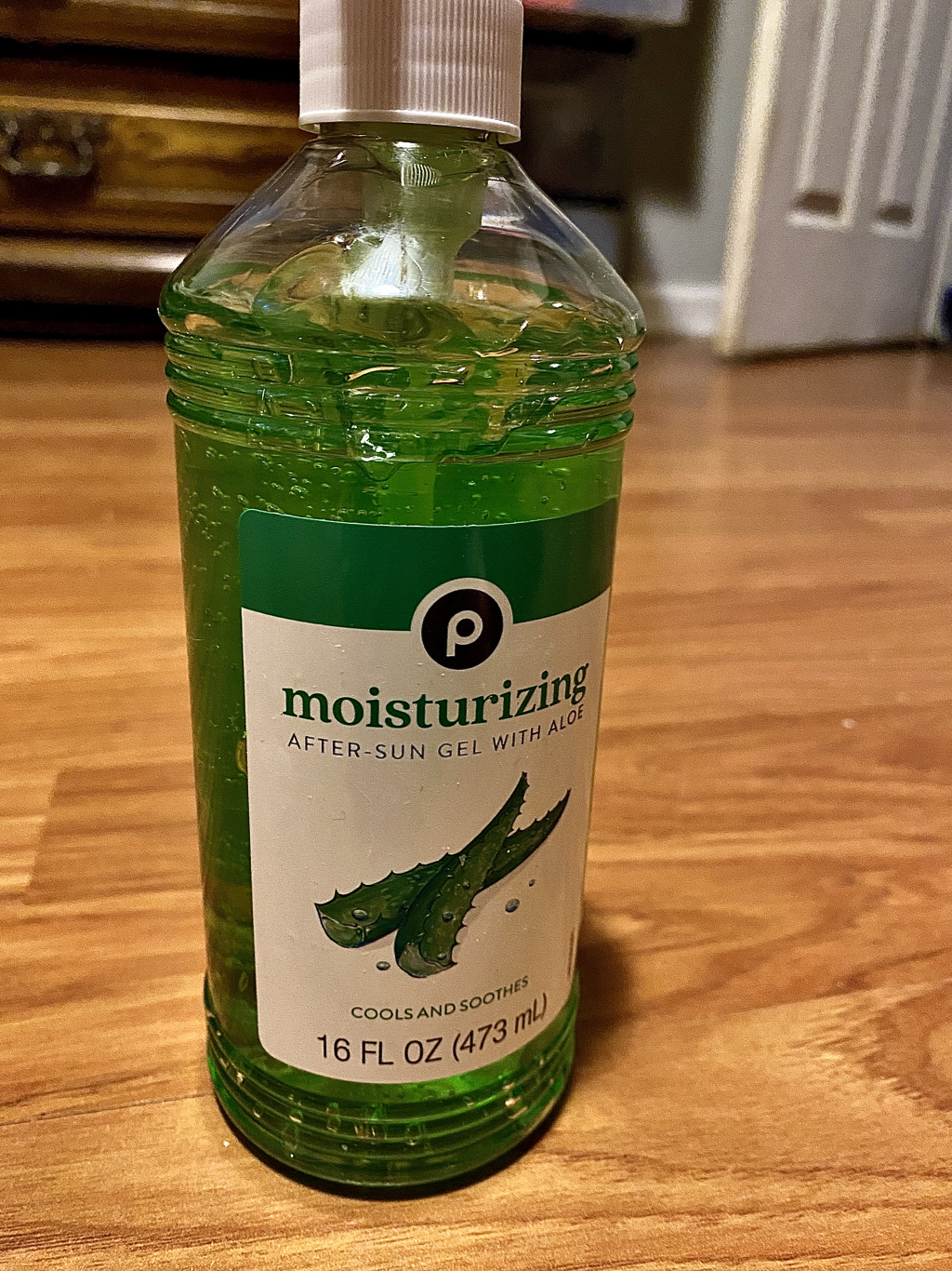
10. birds eye view of hair care products
11. birds eye view of shoe
12. birds eye view of hat
13. worms eye view of cat
14. worms eye view of lipstick
15. birds eye view of pencil
2. Birds of view of plant
3. birds eye view of cat
4. birds eye view of flowers
5. birds eye view of mug
6. worms eye view of tree
7. worms eye view of soccer ball
8. birds eye view of piano keyboard
9. Birds eye view of jar of stuff
10. birds eye view of hair care products
11. birds eye view of shoe
12. birds eye view of hat
13. worms eye view of cat
14. worms eye view of lipstick
15. birds eye view of pencil
Look at that view
Final drawing
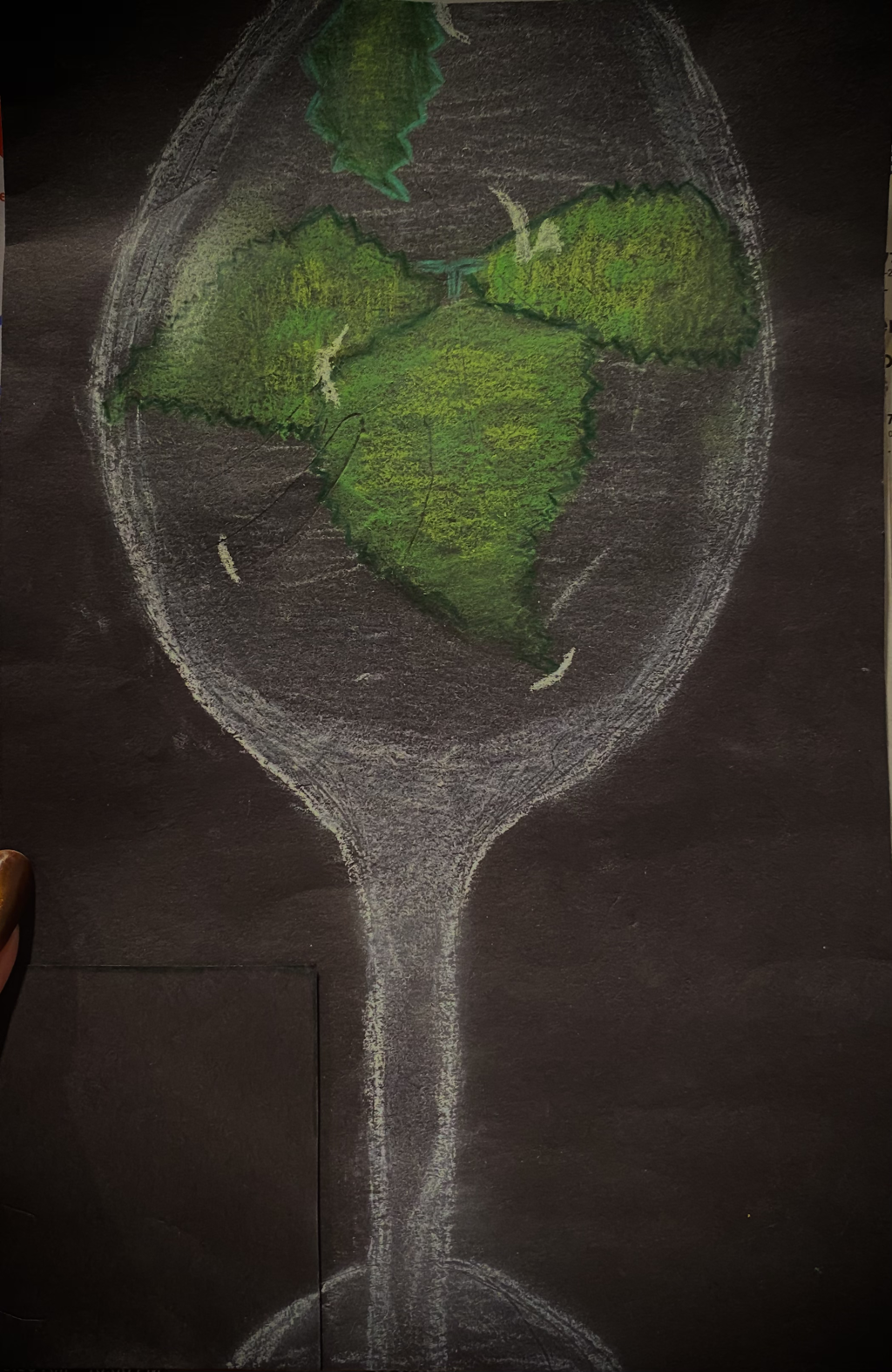
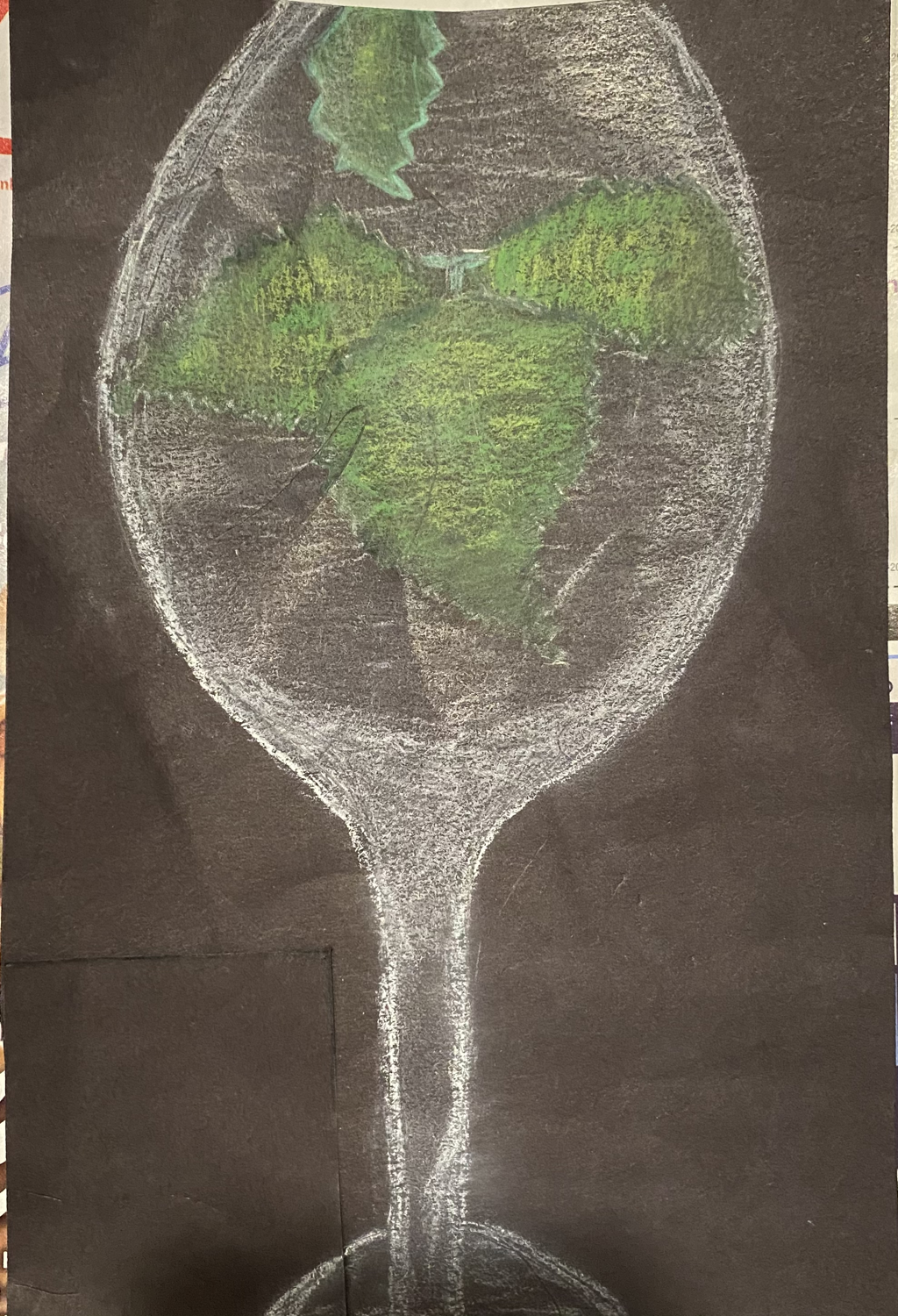
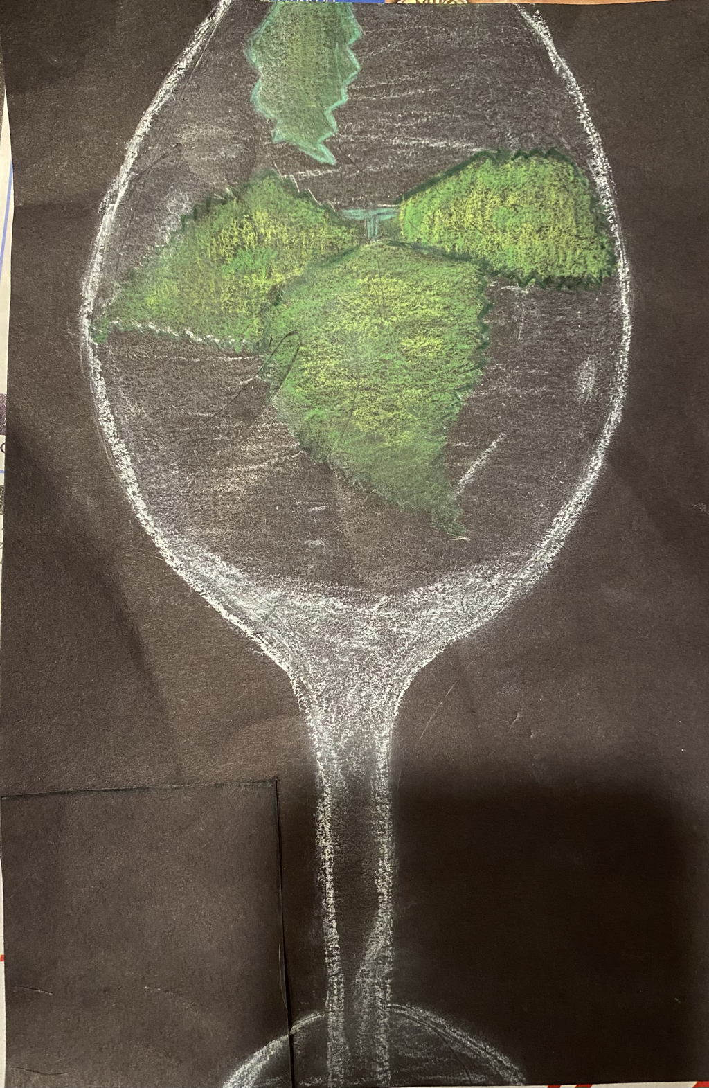
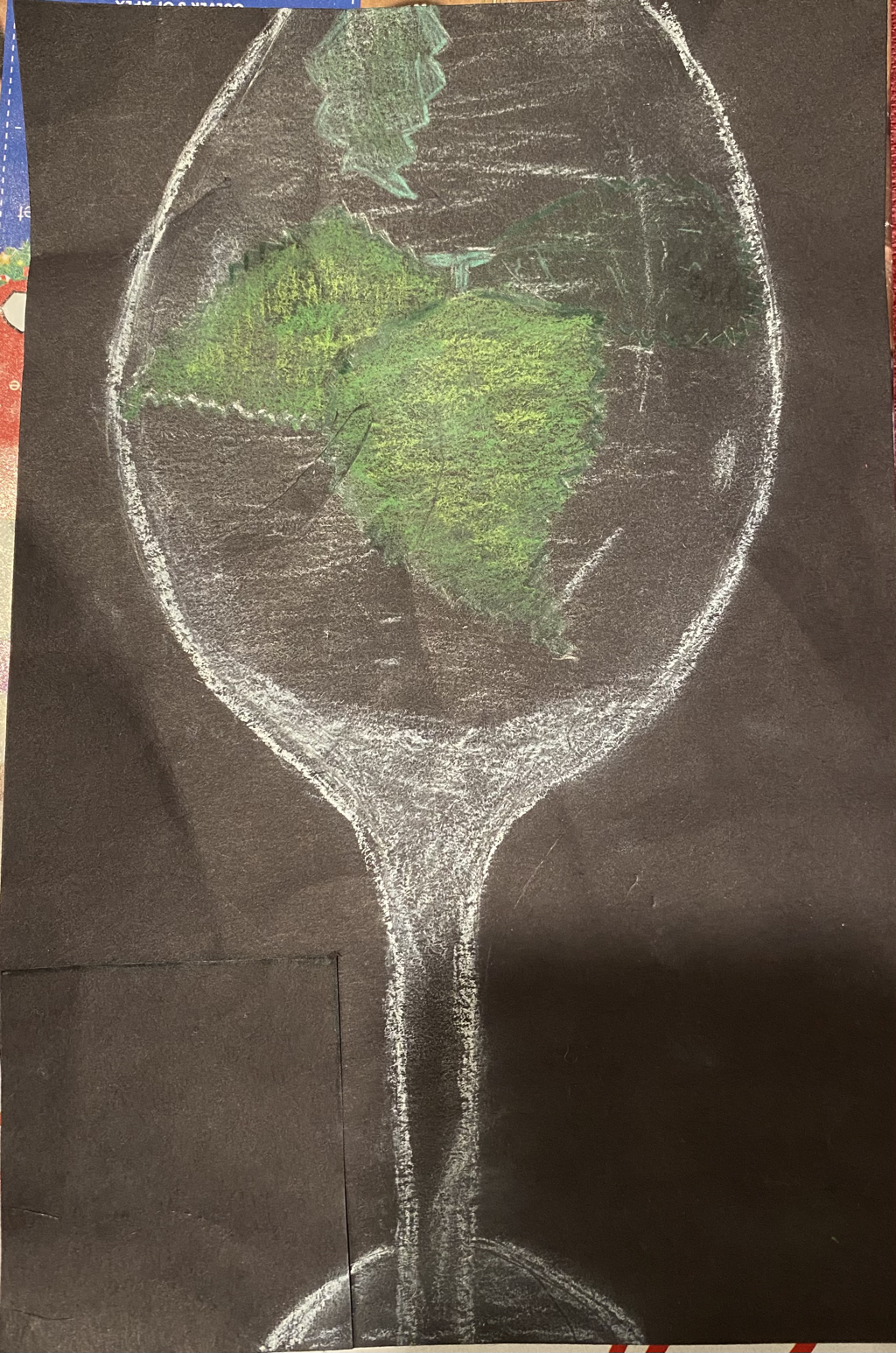
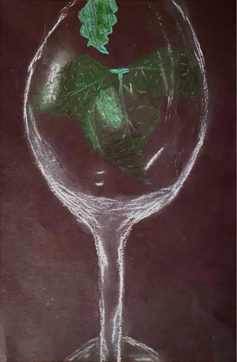
1. I think it was neat but not very well executed.
2. I used a lot of white and put white over the leaves to make the transparency look more natural.
3. The colors I chose went with the color of the picture like the leaves. The top leaf was darker than the others so I drew it that way. The leaves had different shades of green throughout the leave too.
4. I made some leaves look like they are folded so that it looks like it’s going around the wine bottle.
5. I made sure some parts had more whites than others and outlined the leaves a darker green so they could pop out more. I also make the middle part dark, then light for the lighter parts and then darker on the outer parts.
6. I think it is important to practice different media’s. It will make you a better and more versatile artist. The mini assignments were beneficial because it helped us practice with different media especially the prisma, which was the hardest to draw with for me.
7. The prisma was difficult because it smudged everywhere and it was very thick. What I could do to fix this is practice more with it and search up techniques.
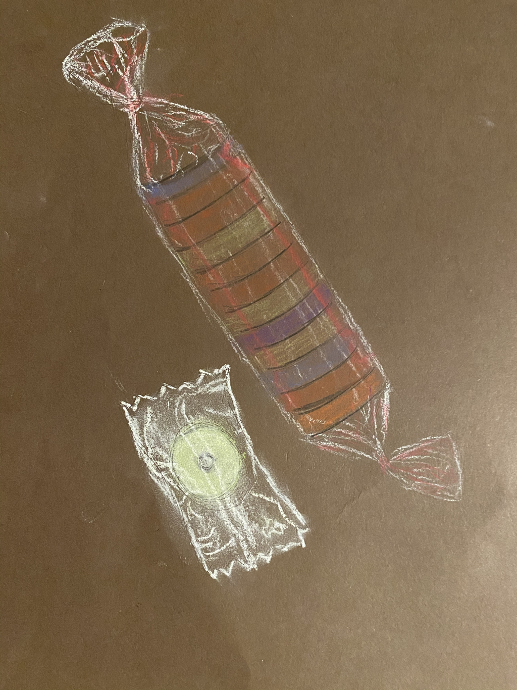
.1. Glass candy jar
2. vase of flowers
3. clear candy bag
4. glass bowls with fruit
5. ziplock bag with pencils inside
6. Fish bowl
7. sunset through window
8. orbeez in clear jar
9. clear chandelier
10. looking through with microphone
11. clear phone case
12. bag of bread with loaf inside
13. bubble wrap
14. jar of pickles
15. Jar of olives
Fabric and ribbon
Still life
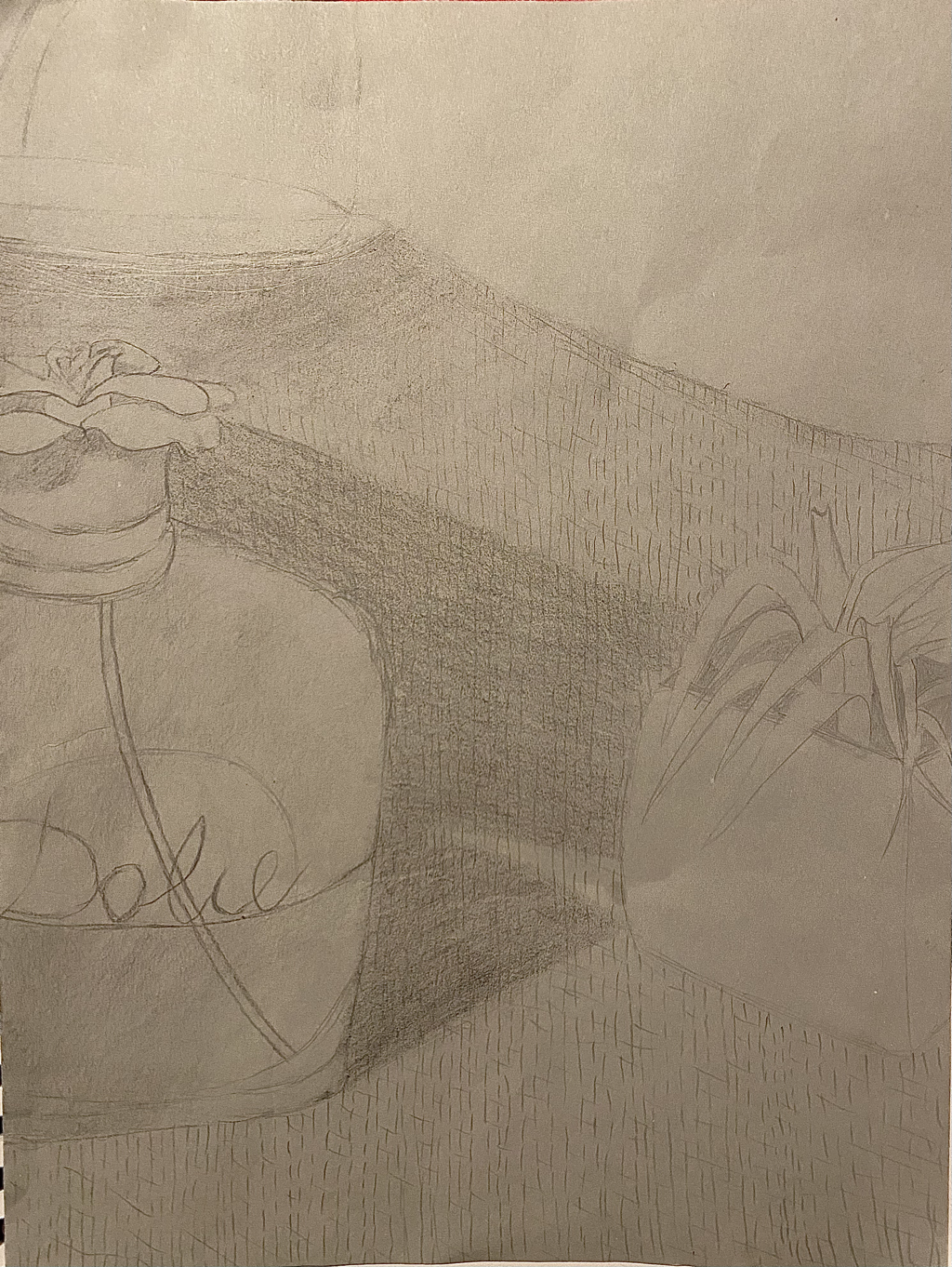
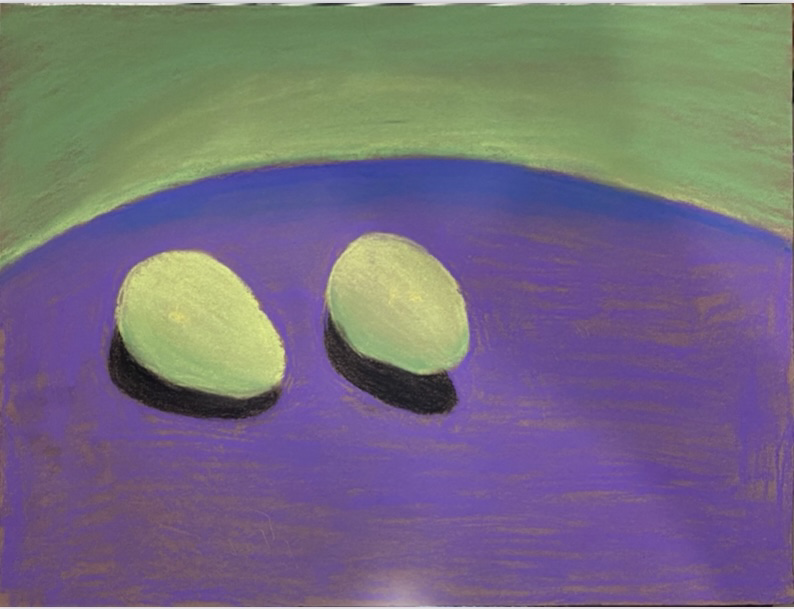
1. I feel like there is a lot of smudges, which I don’t like.
2. I feel like my values and shadows were realistically in the right place but I could have made them darker. I have at least 5 values. Values are important because they create illusion and make the drawing way more realistic.
3. Not really
4. the compositional sketches were important to help me practice with shadows and values.
5. My final drawing was successful because I did a lot better on this one than on the other sketches. The sizes of the objects were much more similar to the picture than the other ones.
6. I feel like they are correct because they all are in the same size and the proportions and similar to the picture I took. The perspective is a little off though.
7. I think the placing was good because I could fit all the objects in one photo more easily. For example the jar on top of the cloth that was being held up by a vase.
8. There is no center of interest.
9. I feel like I could’ve handled my time and recourses better. I could’ve started the day of and had worked on it a little everyday instead of rushing it the last few days. I see that I need to improve in blending to create realistic shadows.
10. I had to redo this drawing like twice because I kept messing up the proportions and location of each object.
11. I have learned more about proportions and how values work to create a more realistic drawing.
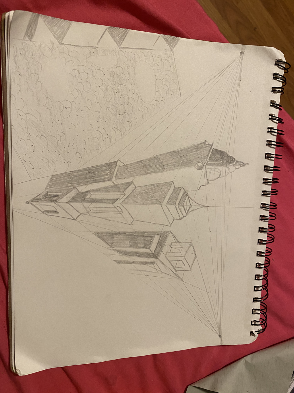
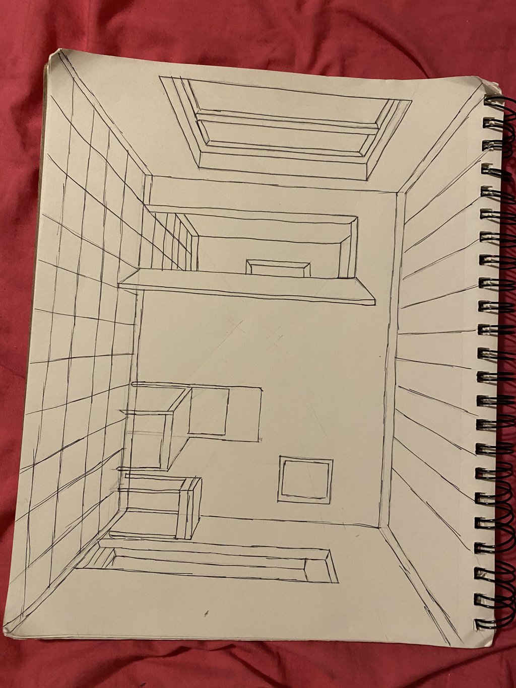
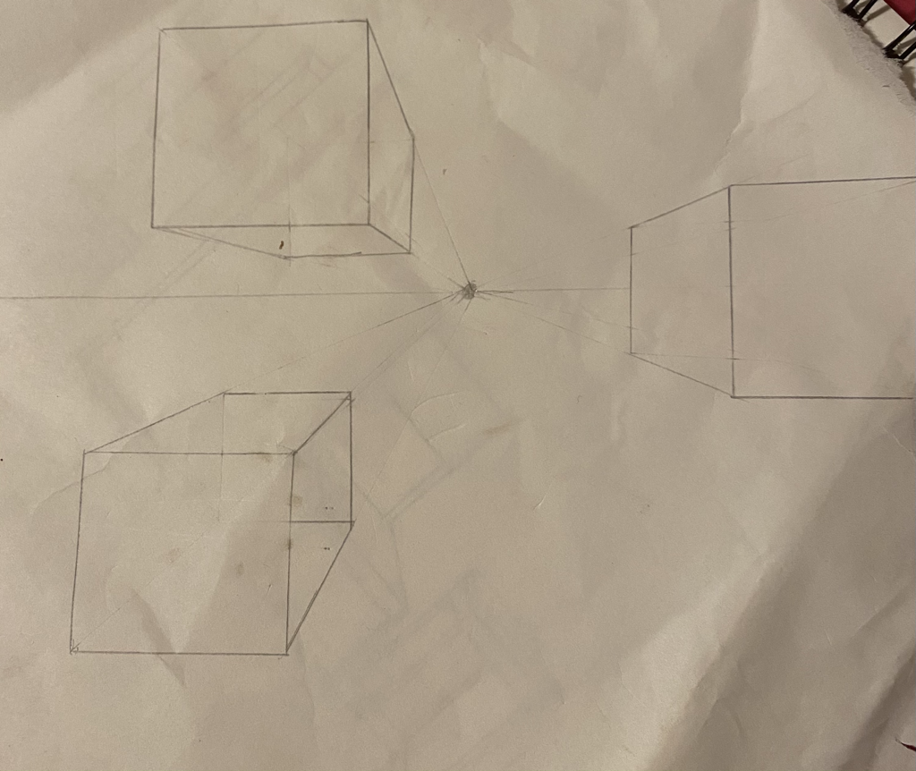
3 pt perspective
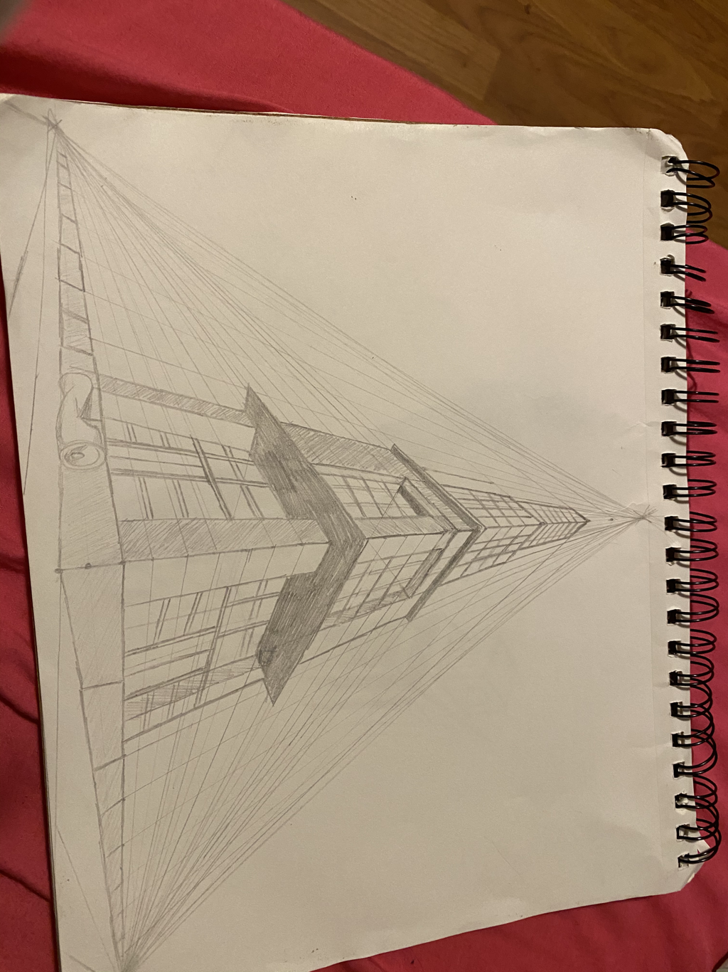
2 pt perspective
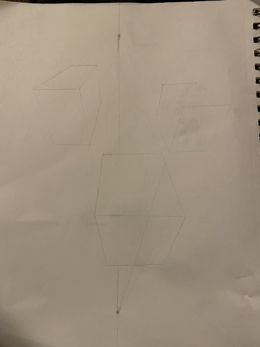
1 pt perspective
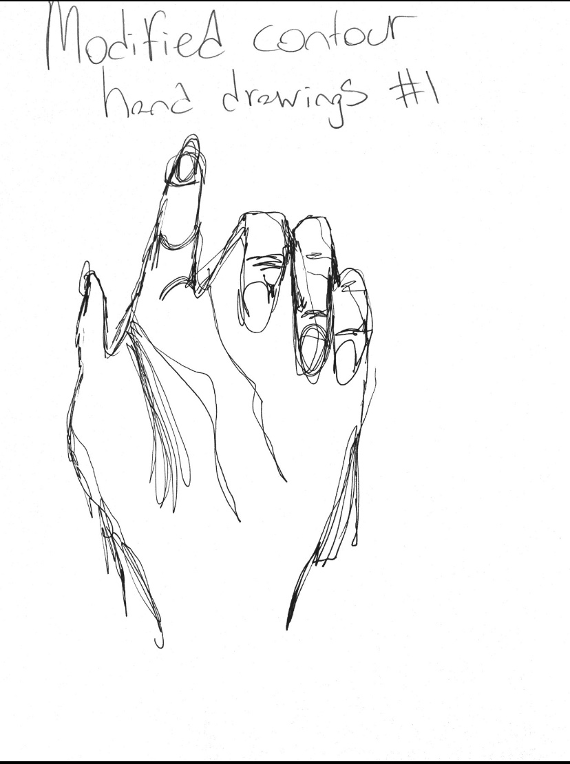
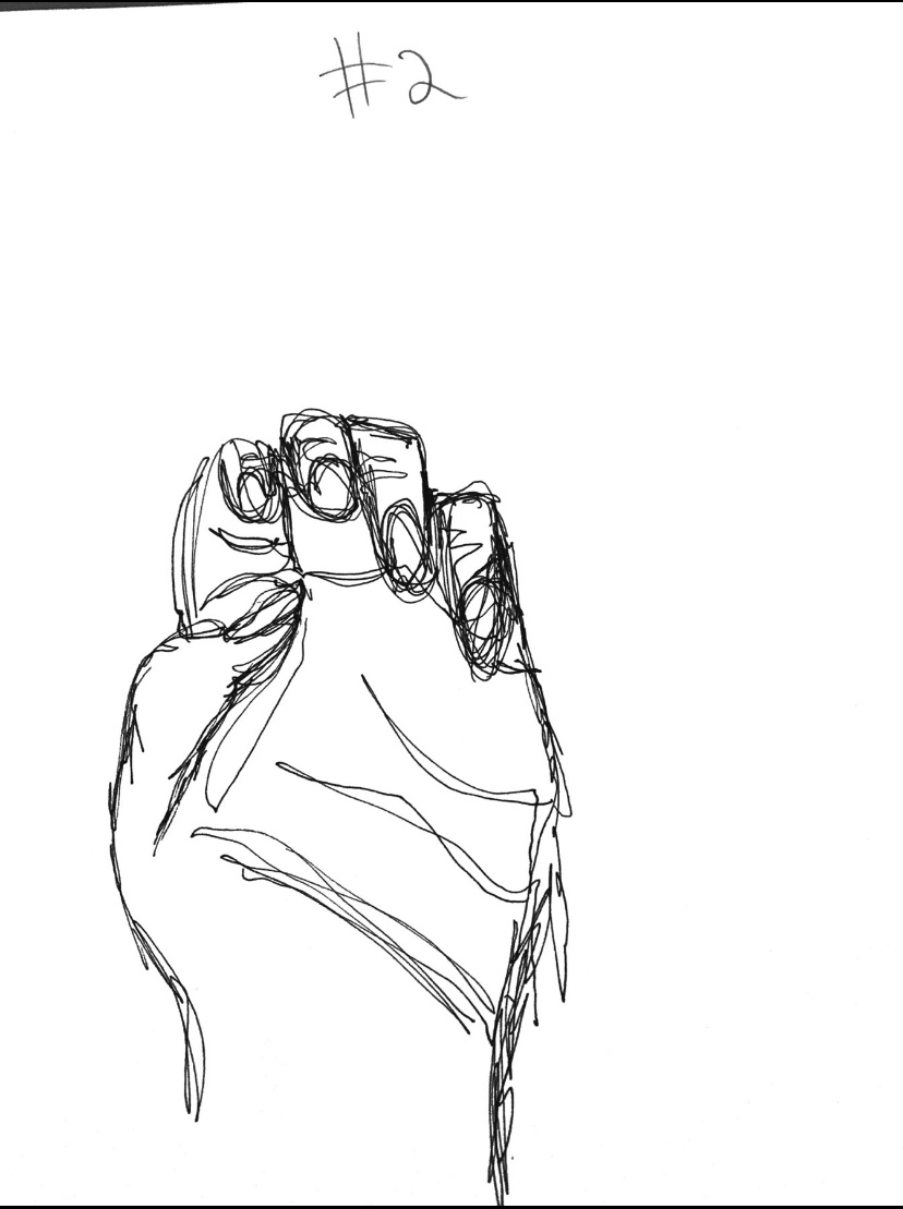
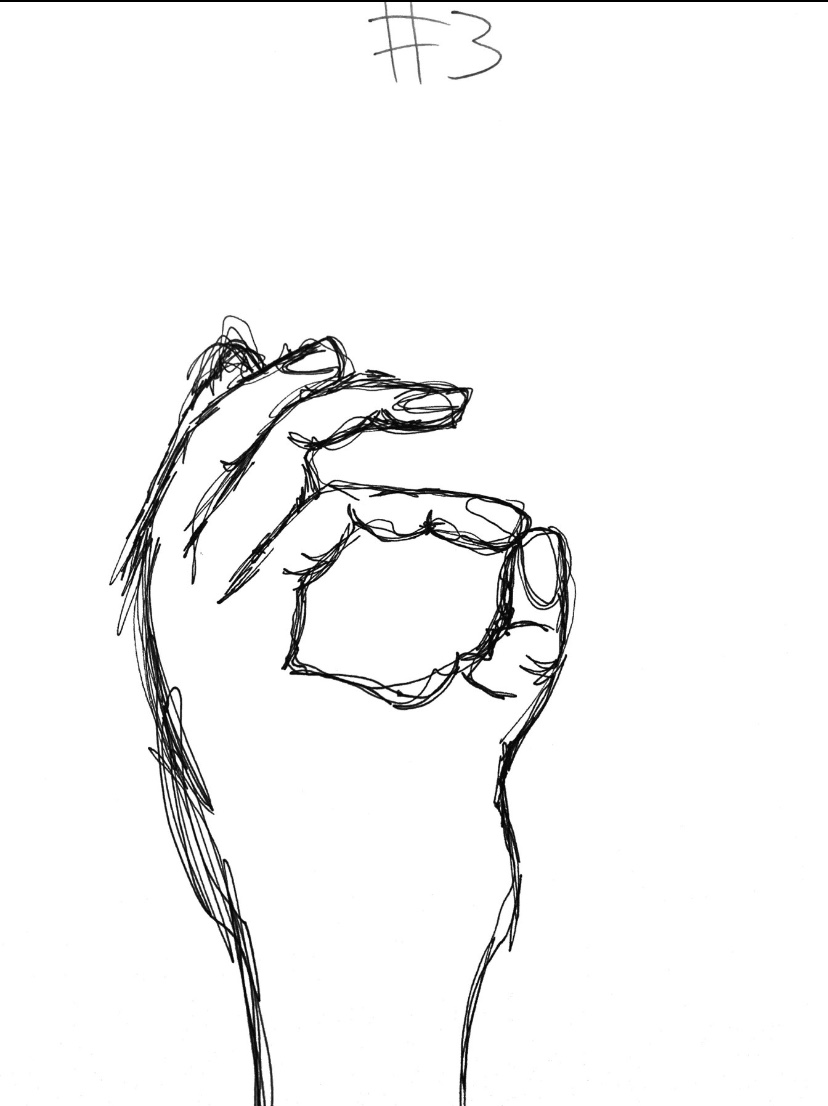
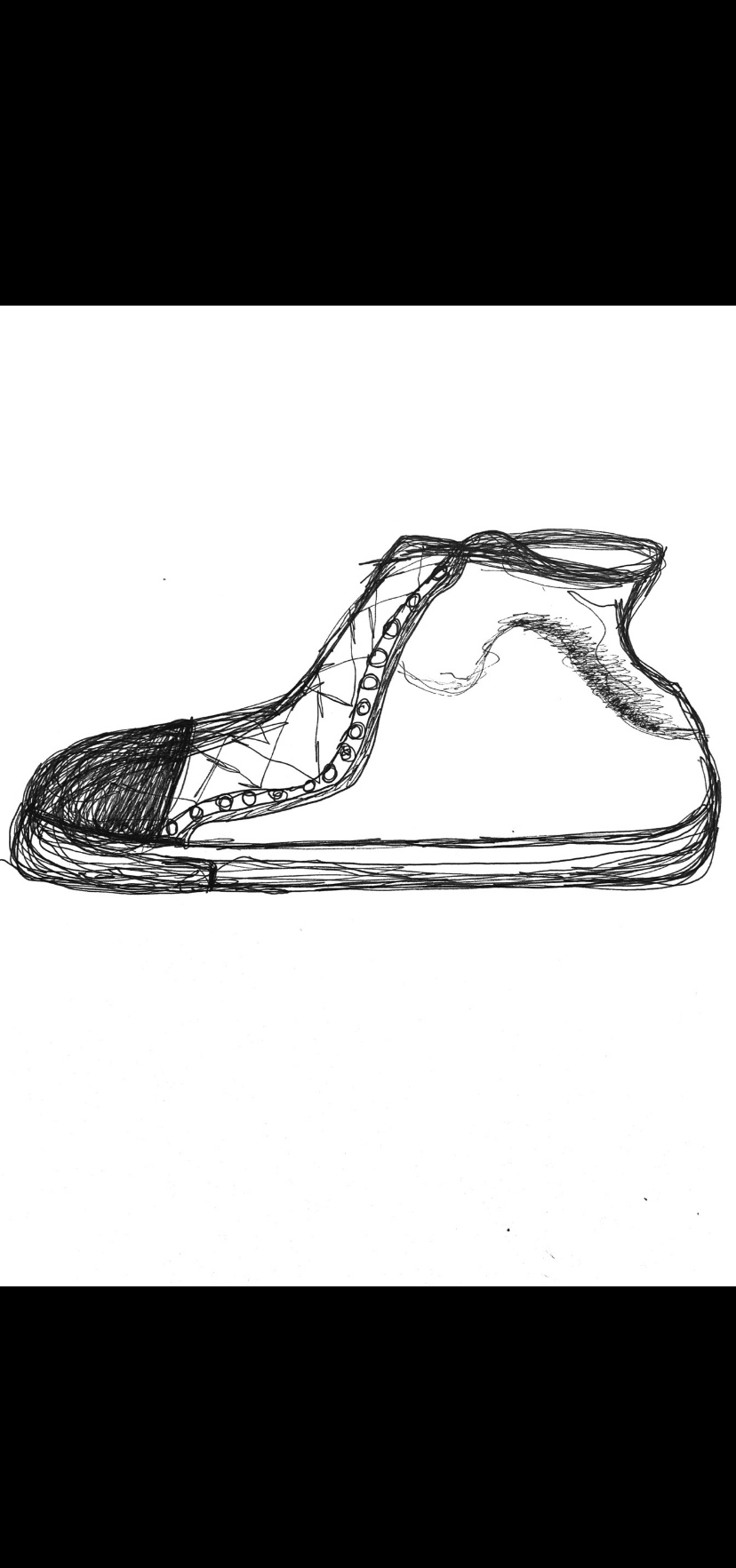
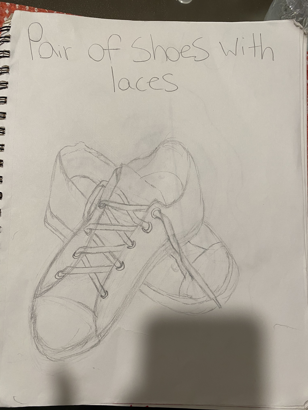
CoNtour shoE
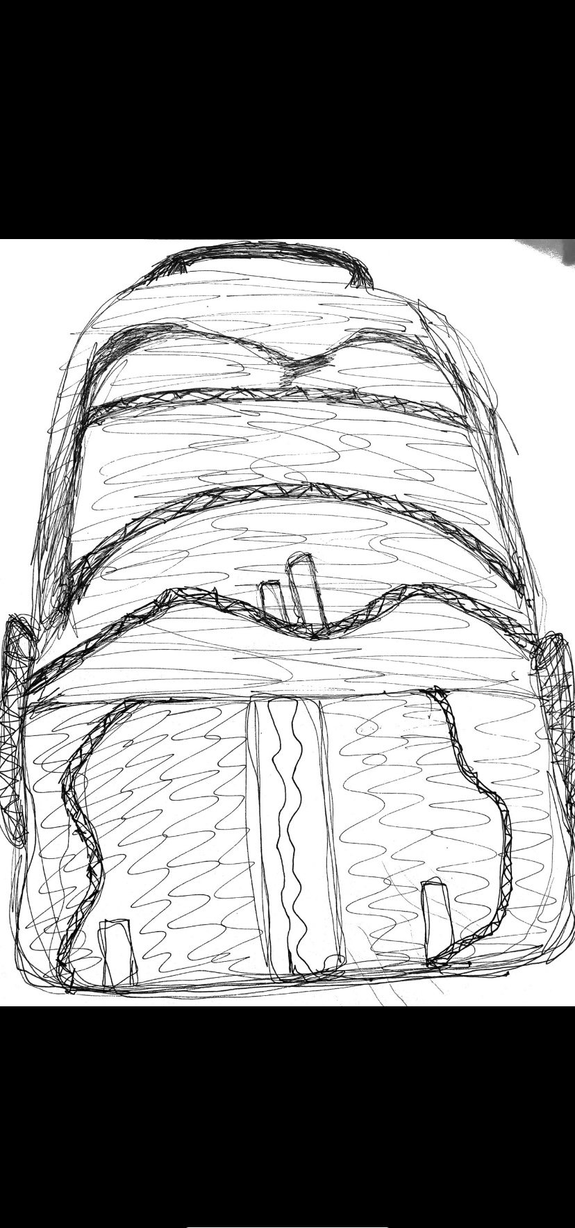
Contour BackpaCk
FiNal phOtos
Practice photos
3 photo series
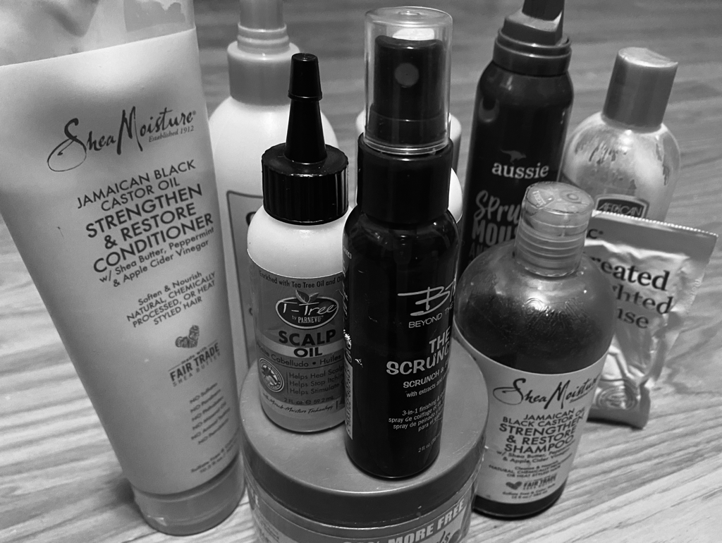
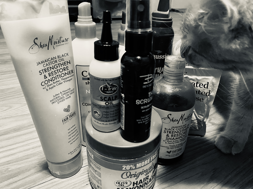
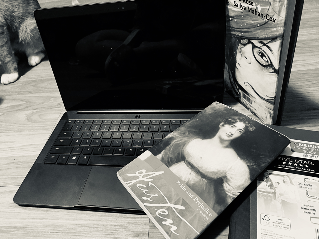
The first is a picture of most of the hair care products I’m currently using. This picture is taken from kind of a side angle. It is like a high medium angle. The second one is a picture of my supplies for virtual learning and this was taken in a high angle. The last one is a picture of my cat. This was taken in just a regular medium shot.
These are all in black and white. I chose this color because I feel like it makes the shadows more visible and just makes the pictures stand out more.
For proportion wise, I tried to make all the hair care products around the same height except for the last ones. It would gradually start to get smaller. For the second one, I tried to make all the supplies spread out in a way where everything can be seen better.
I took this photo to show how committed I have been to taking care of my curly hair during quarantine. I also took the pictures according to which products are my favorite.
what I found successful about my piece is that I displayed the products according to what my favorites were along with size. I like how I could also make the products get gradually smaller.
Object photo composiTion
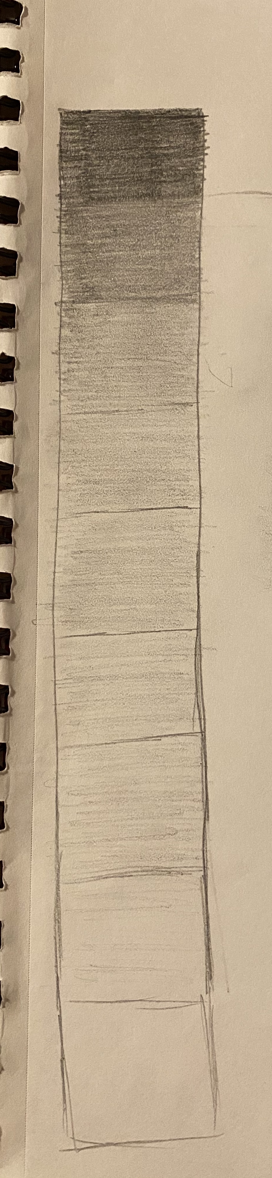
9 step value chaRt
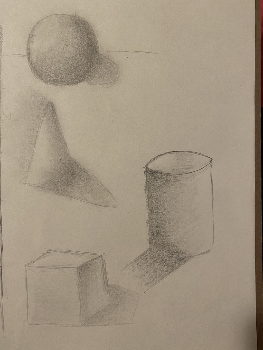
Value formS
4 assessment drawings