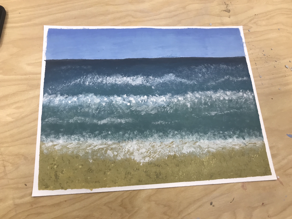
1. THe CRITICISM process has 4 steps. The first step iS to describe the artwork. You list what you see in the artwork and the images as well aS describing the colors used and which art elements. The second step is to analyze the artwork. In this step you list art elements and Design principles as well as color, Value, line, shape/form, teXture and Space. You also keep in mind the balanCe, emphasis, harmony, variety, movement/rhythm, proportion. NeXt is to intErpret the artwork. In this process you find out what the mood is, what feeling is being communicated, what ideaS are represented and what is the story being told. The last step is to judge the artwork. This inCludes what you Think of the artwork, if its successful and why or why not. You must support your opinions with evidence or criteria.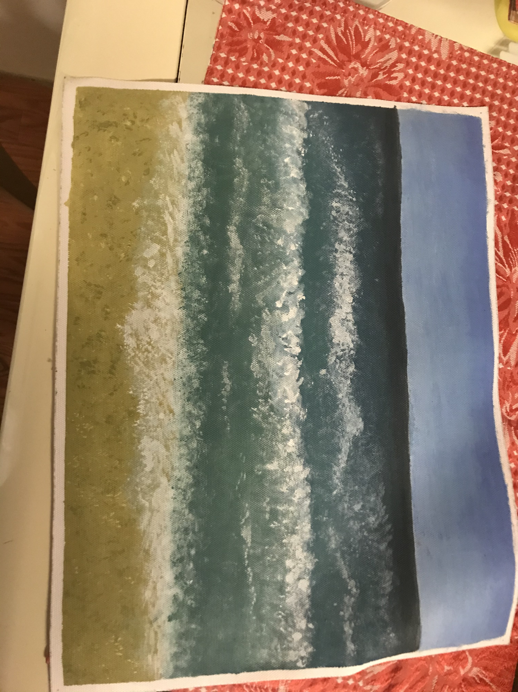 1. What i see in this artwork is the beach and sand. The artwoRk contains acrylic paint iN different colorS. The elements color and shape Is shown well in this piece. This painting was made on canvas paper. The texture is Shown on the sand with the Different colors included. For the beach, the water gradually went from light to dark to Give a pErspective from close to far away. The beach is a good Example of balance. There is moVement proviDed in the waves. The mood in this painting is very tranquil, serene. The way i would interpret this piece as a story is a peaceful day at the beach and Kind of pAusing time and Just enjoYing natures beauty with no problems in mind. Overall, the Painting Was successful becAuse the painting has balance, pErspective, teXture, eTc. To make it look more realistic. You can tell thats A beach and theres a sky, sand and waves. |
Into to drawing project 1


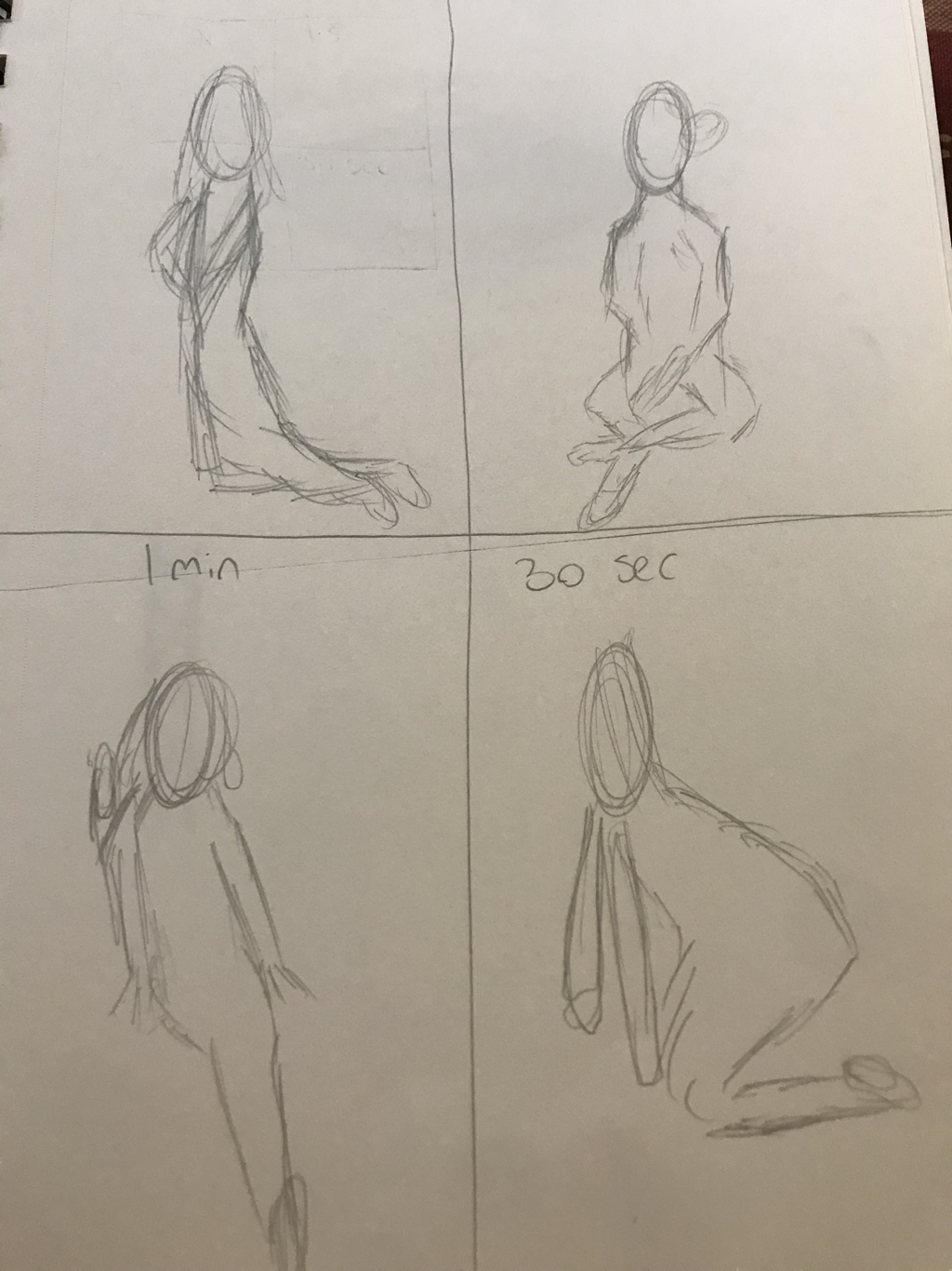
1. The upside down Picasso warmup was the most helpful because it showed me that it’s not all about what your trying to draw but the types of shapes you see instead.
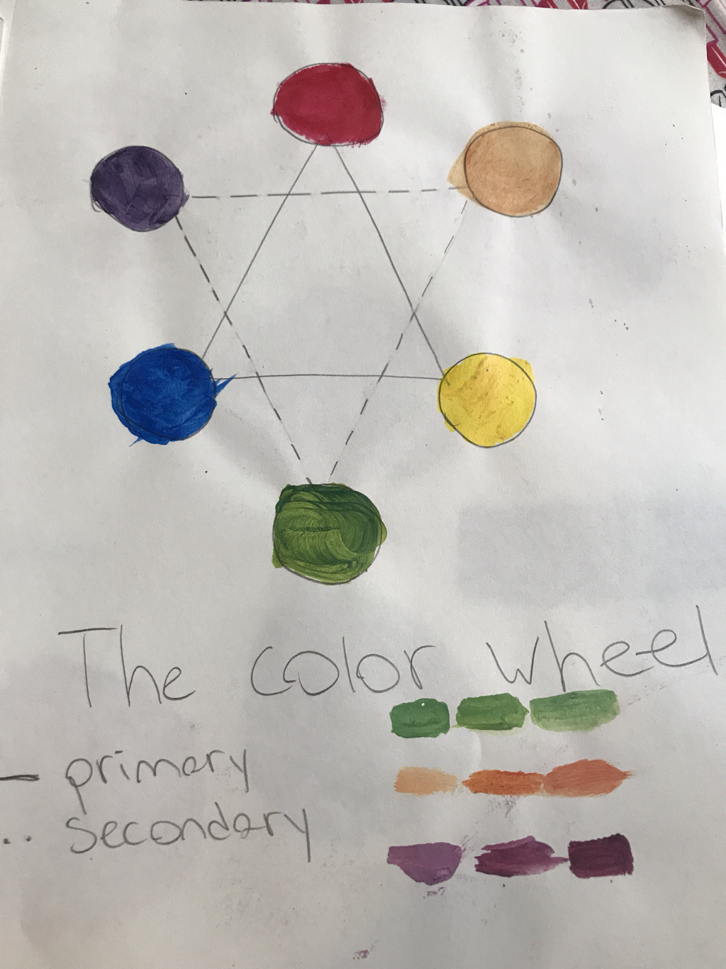
2. Composition: the placement or arrangement of visual elements in a work of art, as distinct from the subject.
Value: element of design that defines the light and darks in an artwork 3. Charcoal:
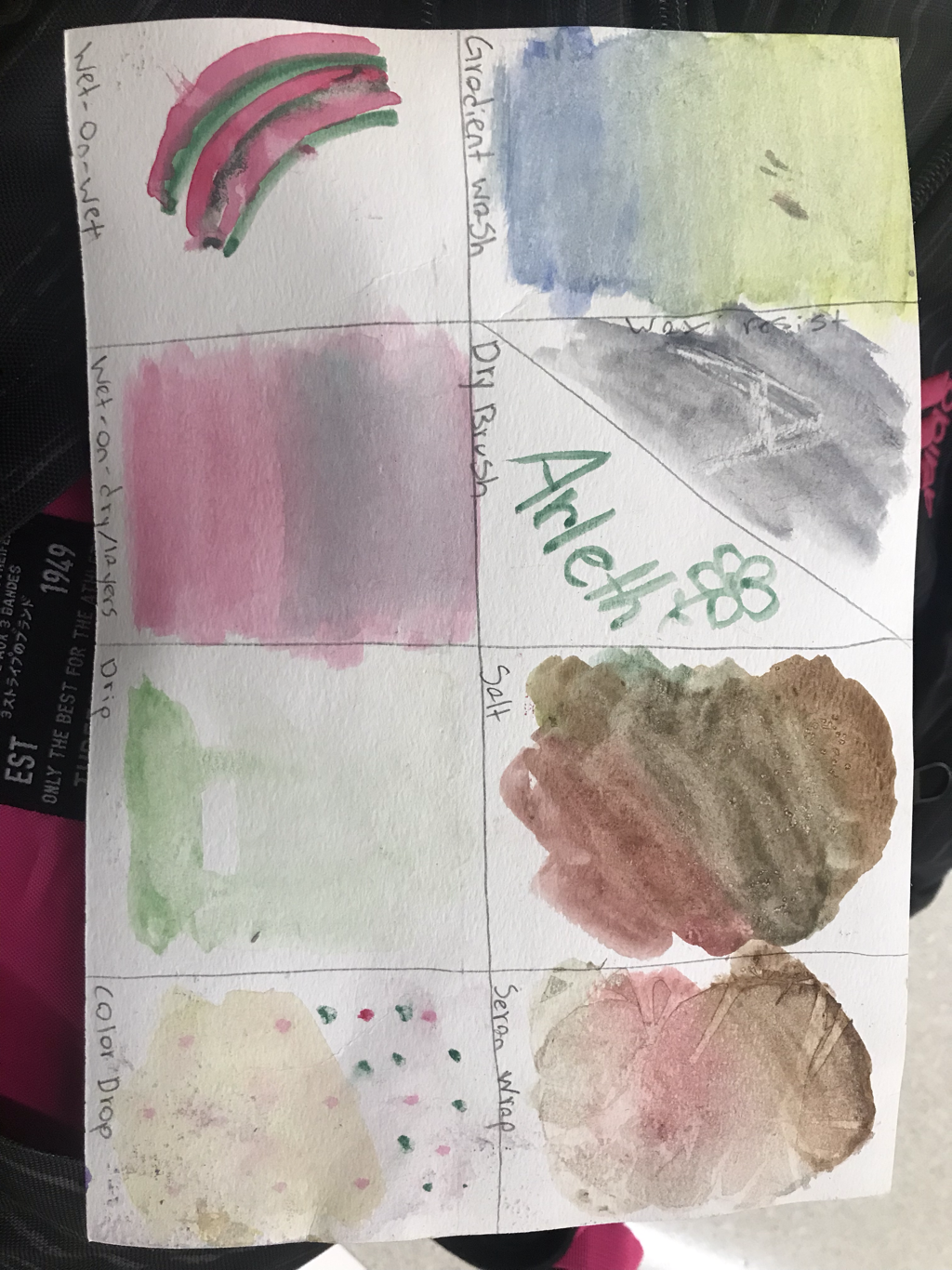
Pros: shows value really well. It’s also easy to erase or just blend in if you mess up. Cons: it’s really messy and smudges really easily. Pencil: Pros: you can easily erase any mistakes made. Cons: You can accidentally erase a little too much when you’re Just trying to erase a little. Pen: pros: it looks more pretty and it isn’t messy or smudgy. Cons: if you mess up, you mess up. Also hard to create valve and shading. 

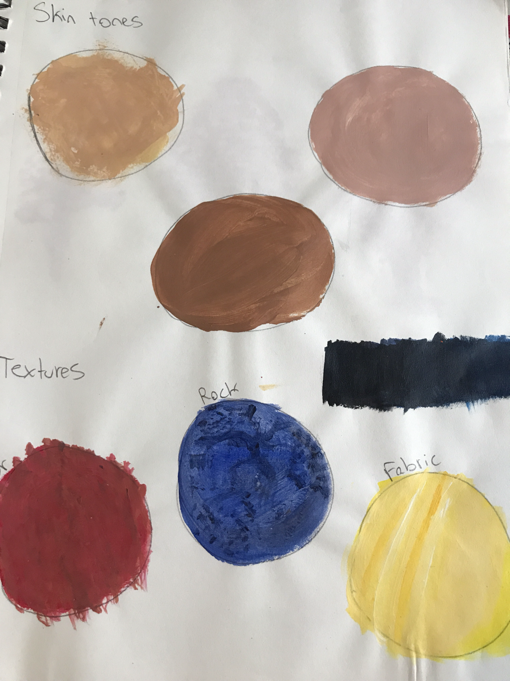
1. What I learned about these activities is how important it is to know how to blend and just make each color work together to make a painting pop and look more realistic.
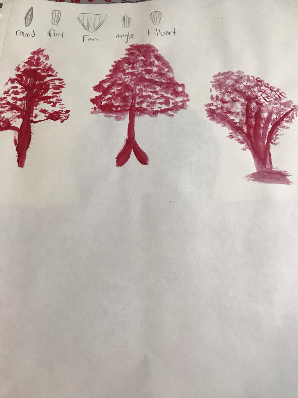
2. I think the textures will be more helpful for the painting I have planned because it will help make the painting more realistic and defined. 3. I learned most from the skin colors warmup because it helped me learn what colors to use to make it. I learned that different skin tones have pinkish undertones while others have more yellow. 4. Some ways to make brown is to mix darker colors with yellow and just a little bit of black. If there’s too dark some white helped too. 5. To tone down a color, you add a little bit of black or brown Idea of placeIDEA OF PLACE
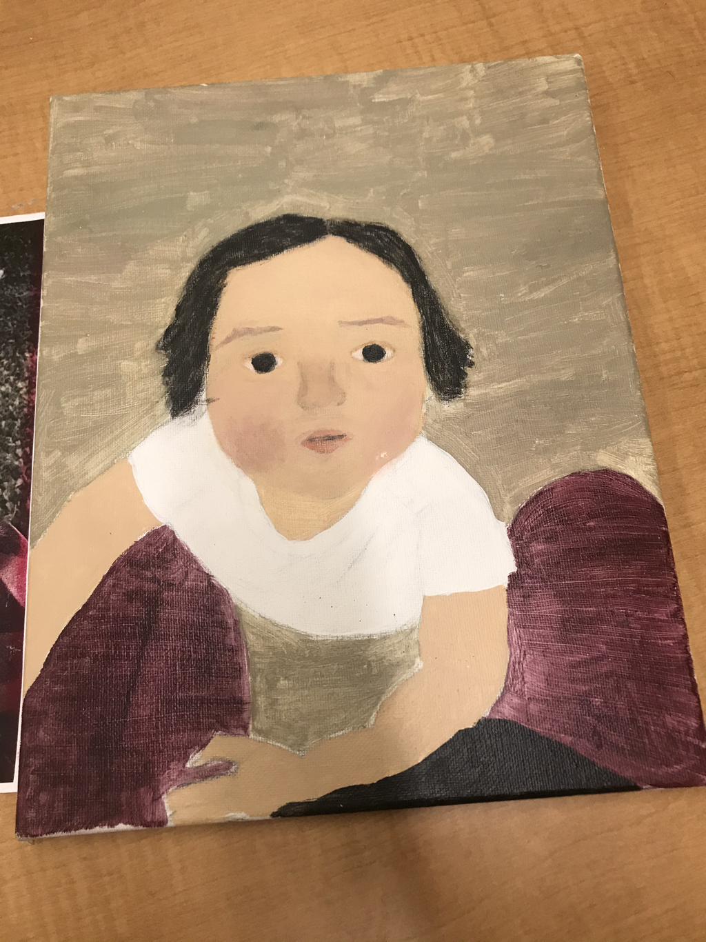
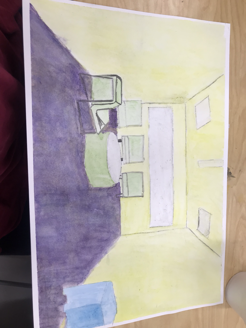
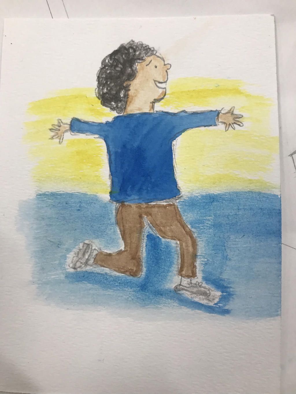
Painting progress
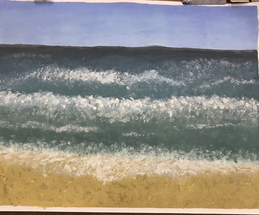
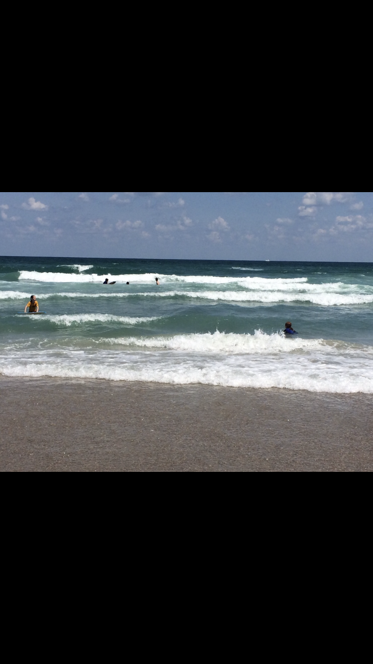
This place that is represented in my art is a picture of myrtle beach. What’s important about this place is that it was the first time I had gone since I was 5. What was most challenging about this painting was trying to make the waves look realistic. What I feel was most successful about this painting was is the change of blue according to the distance.
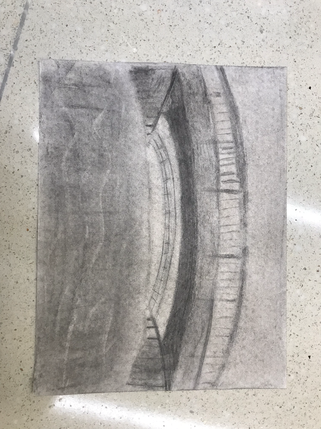
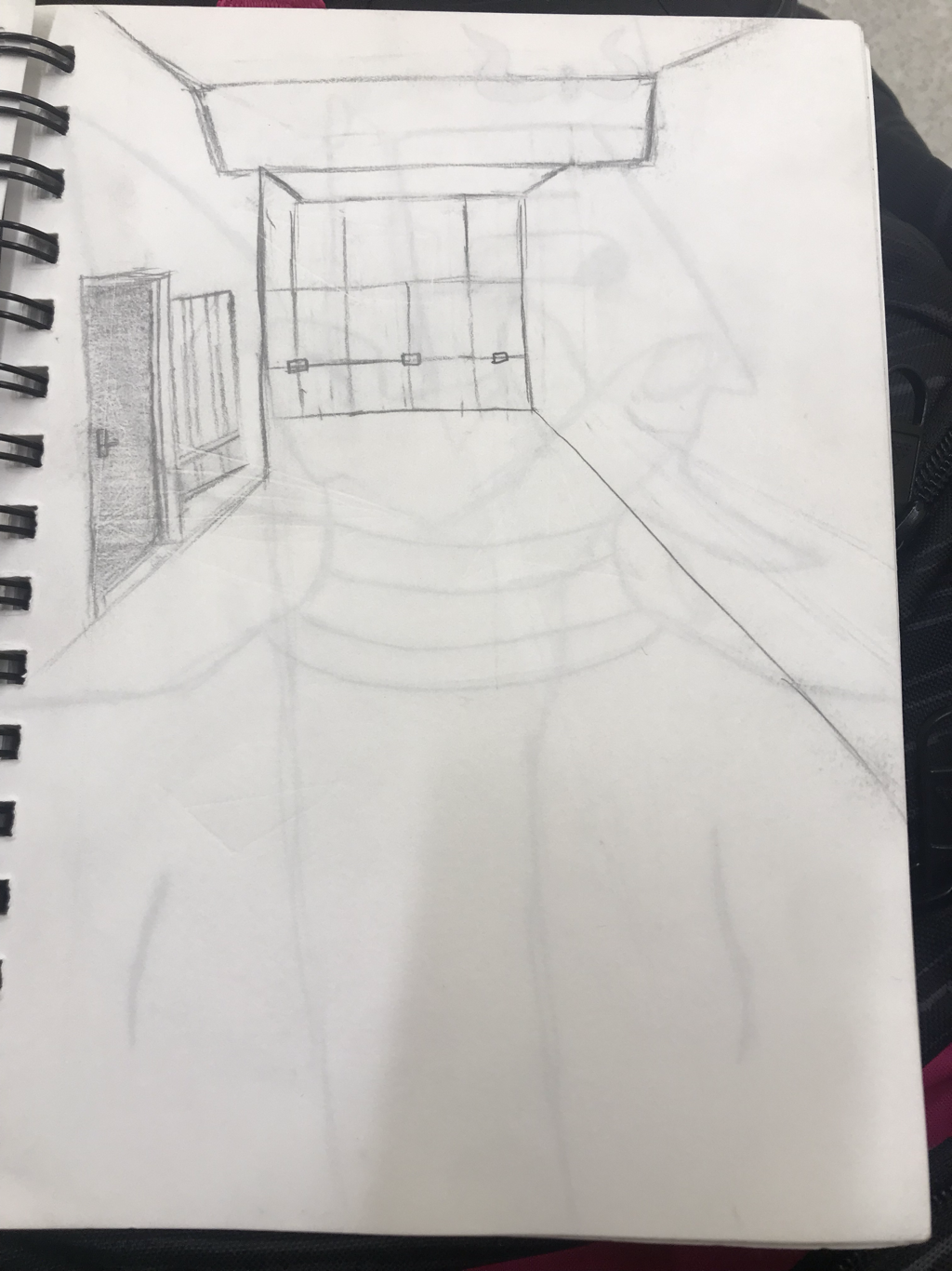
Watercolor perspective 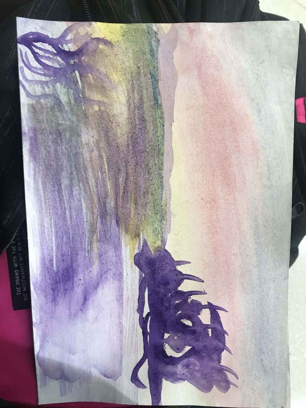


|